Breathe (Mexico City)
Mexico City, Mexico. In a city famous for it’s smog, this reminder looks like official traffic signage. Except for the kerning.
Mexico City, Mexico. In a city famous for it’s smog, this reminder looks like official traffic signage. Except for the kerning.

Mexico City, Mexico. The symbol encourages motorcycles to park head in, making a backwards shadow.

San Francisco, CA. Hashbury Historical Museum. The power of suggestion works both ways here. The negative suggestion is dominant: Don’t look in here! As the most prominent text, it seems to refer to the blank area around the vitrine. More importantly it draws visitors in from far away. Who can resist?

The positive suggestion is secondary and much smaller: Please look in here. Referring to each of the small window vitrines, such as Jerry Garcia’s finger,

and Jimi Hendrix’ joint,

and best of all, the actual heart that was left in SF.

This small corner window museum, with prominent window reflections of the street, is an installation by artist Porous Walker (RVCA, Artist’s Network Program). It’s a brilliant play on museum language and artifact.

San Francisco, CA. Legion of Honor. In the “Truth & Beauty” exhibition, I noticed a few visitors sketching. It’s not an unusual sight I guess, but it triggered some vivid memories and associations for me. My mother, now in her 90’s, is an artist who values sketching as “a way of knowing.” When I was young she taught me to practice it when we were traveling or hiking in nature. Devotees know that drawing is a deep way of seeing. To me it’s a kind of “hand thinking.” A meaningful alternative to taking photos, and a powerful way to “take notes,” about virtually anything.

In terms of visitor holding time, sketching visitors “in the zone” are like solid gold rocks in the constant stream of visitor flow. Even a 10 minute sketch is a long time to observe a piece of art. In crowded exhibitions, the presence of sketchers underscores the tension between crowd control and engagement.

Sketching is a time-honored tradition in art museums, but other museums should be sketching friendly as well. “Hand thinking” can be about anything. Museums that have sketching policies have common sense guidelines, such as dry medium only and size restrictions, etc. Some go further and actively promote drawing, offering creative tips, activities, and stools to carry around.
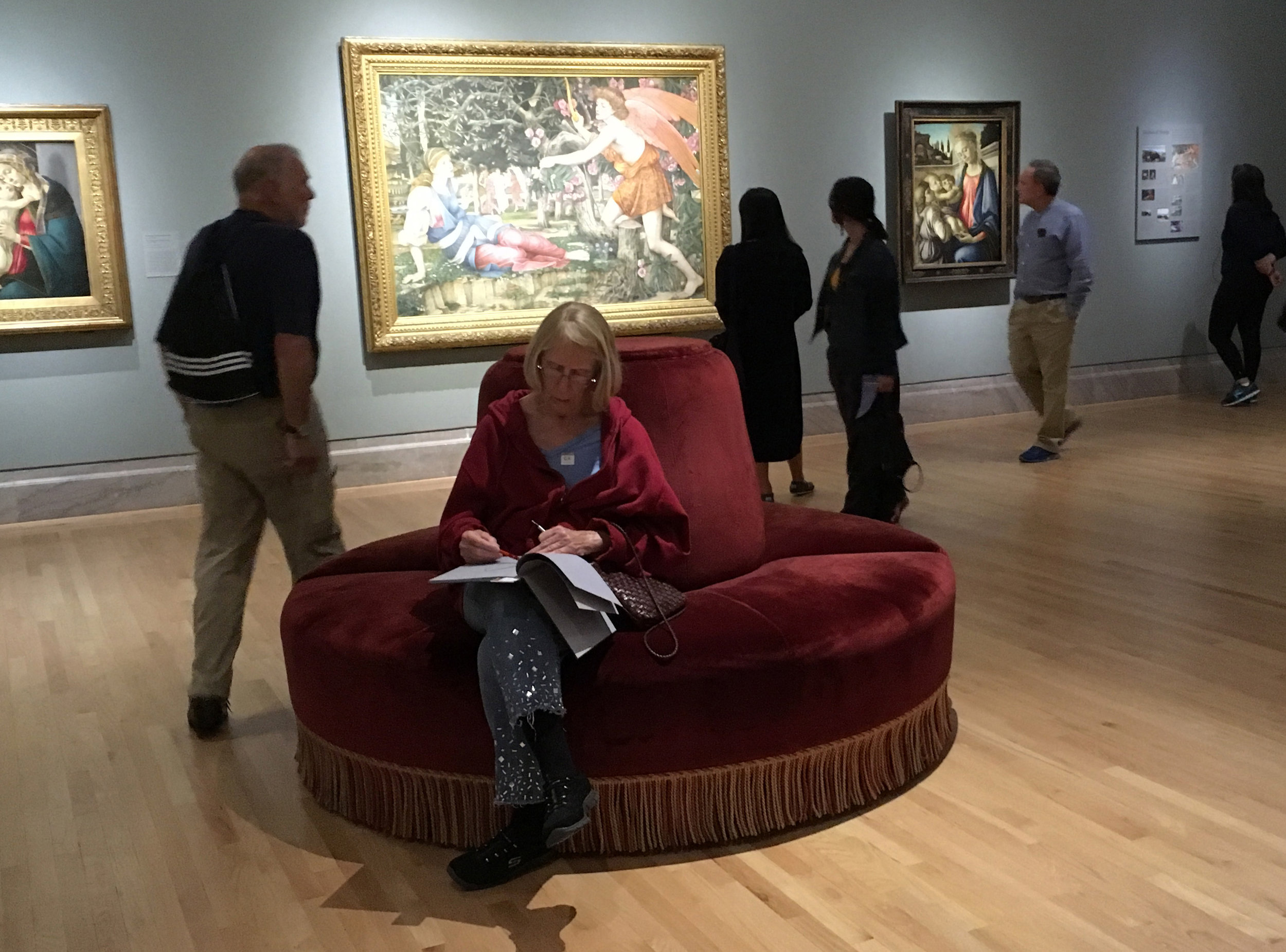
Seasoned museum sketchers are by nature extremely polite. They are ninjas at being unobtrusive, drawing without drawing attention to themselves. Simply viewing is a kind of mental “copying," a way to analyze and understand. Sketching, as a more involved form of “copying” goes further to inform the visitor’s personal creative process.

My real reason for coming to the Legion of Honor was to meet up with my friend Stephen Woodall, the Logan Collection Specialist for the Achenbach Foundation for Graphic Arts. He invited us into the museum’s hushed library, and showed us a few of his favorite books in the collection. His knowledge and passion for book arts led to an animated discussion.


If you love artist illustrated books, the Reva and David Logan Gallery is a sacred little alcove. One of the legion’s innovations in book display design is the use of tiny powerful magnets to hold a page spread open.

San Francisco, CA. Yerba Buena Center for the Arts is the “center for the art of doing something about it.” The description of the YBCA Fellows program is fascinating; it brings together creative citizens from across the Bay Area (artists and everyday people) to engage in a yearlong process of inquiry, dialogue, and project generation.

The question for each year comes out of the annual YBCA summit. I came across this one posted in the museum lobby for visitors to respond to. On the museum floor, it raises it’s own question; what question is most affective to ask visitors directly?

Usually the goal for a museum question is for it to be open to everybody and speculative (not right or wrong). It should illicit an immediate and authentic response that draws on personal experience. It should also be thoughtful and provocative, prompting an interest in the response of others. We need to care about the answer, and it needs to be sincere, more than a token gesture, so that visitors know that their answers are taken seriously.

Museum staff know how hard it is to ask a question that truly engages visitors. Specific questions are too much like a test, definitions are too impersonal, and superlatives are problematic. This question most likely falls into the category of too general or too abstract. Maybe it’s a problem of the form; a post-it wall in the lobby environment, without context. Perhaps if it was a seating area with a few YBCA Fellows there in person to answer to, it might lead to actual discussions and something deeper to bring back to the Fellows group.

San Francisco, CA. YBCA, Bay Area Soon. Data visualization is often a kind of techno hypnosis. The power of the data is sometimes lost in it’s visualization, the shear beauty of it’s own complexity.

This Stamen street mural is more accessible. It shows which species of birds can currently survive in the Golden Gate area and which will still be able to survive in 2050.

It seems that graphic simplicity can still play a role in visual summary of complex data, “vividly highlighting the losses and gains.”

Guanajuato, Mexico.




Guanajuato, Mexico. The most tried and true products have their logos carved on the outside wall of grocery stores


The power of inflection in typography, from spray paint to printed italics. From innocent “restoration” to the more suggestive, even sinister “Implementation”

Guanajuato, Mexico. Un Museo Llamada Guanajuato. The trend of digitizing museum content adds more layers of interpretation within the physical museum, and accessibility almost anywhere beyond the museum walls. Technology has a magical superpower of scale; it allows us to drill deeper and be more expansive at the same time. The trend of some travel guide apps is to invite visitors to think of the world at large as a museum, turning cities into interactive floorplans and travelers into virtual scavenger hunters.

When I noticed this (tangible) street marker and discovered this virtual museum, it explained the irritating drones I’d been seeing all over the city. It also seemed to justify them, providing the heady experience of flight on their website, literally zooming in and out of the city.

Technology is pervasive and seductive. And yet “real” or “original” content remains grounded in the physical world, at human scale. Whether it’s a museum object, site, or phenomena, it’s our social experience in real public space that is our inevitable beginning and end point. I wonder to what extent visitors deny themselves a direct experience of their own, before and after turning to the magic superpower.

Guanajuato, Mexico. Guanajuato University Cine Europa. Typography on window glass is like a book cover, a composition of typography over a photograph. Except that the photograph is alive and changing. Like a film.
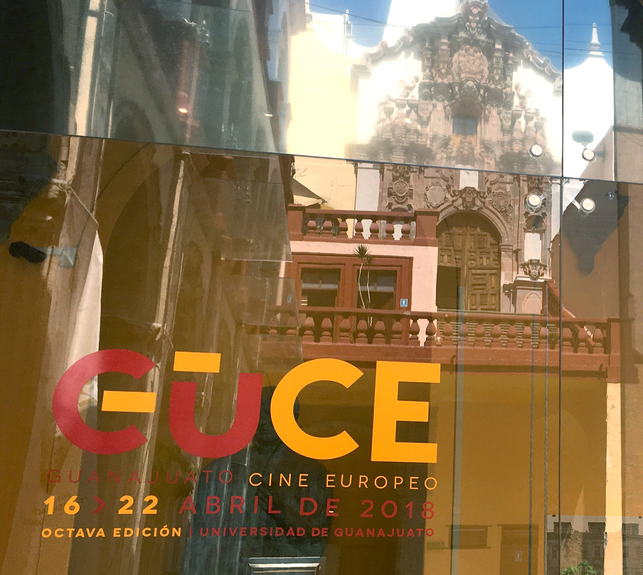
Seen from behind, it seems to reverse the world as well. Like the back cover of a transparent publication.
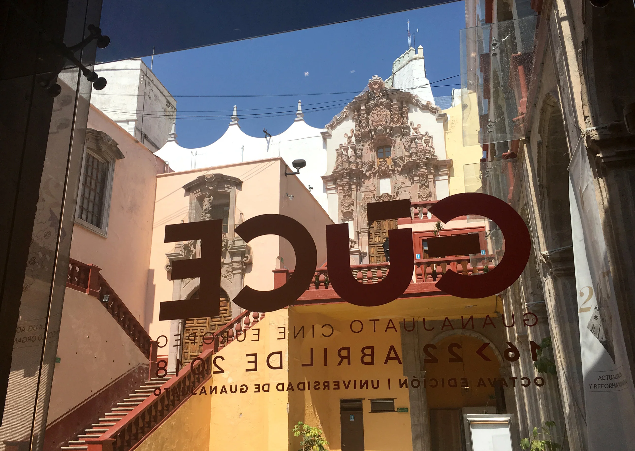
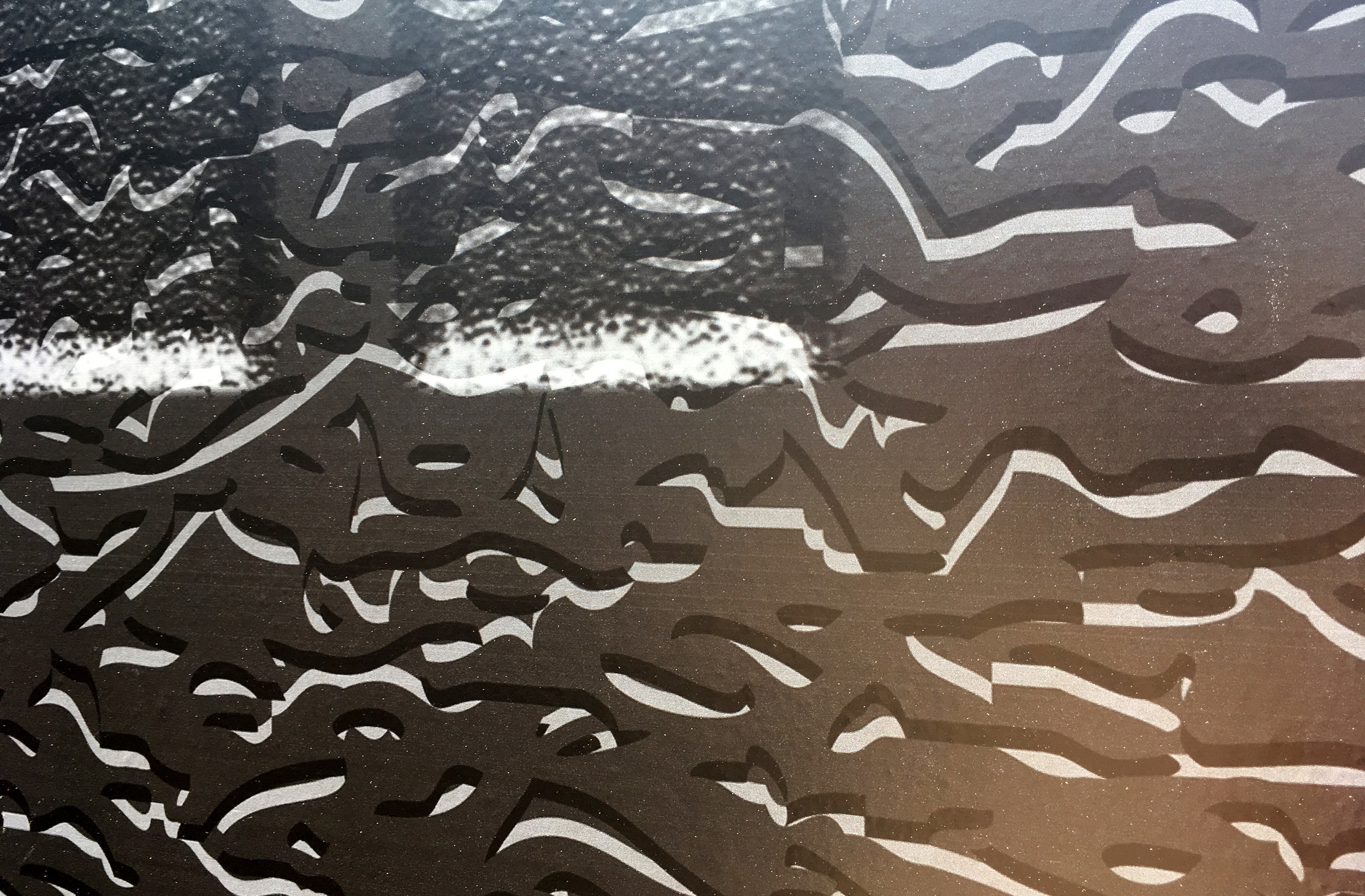
As I walk past typography on glass, I love the movement, the effect is a constantly changing layout. It’s cinematic.

The number 8 becomes the projector, as well as the bicycle. So much going on… it must be exhausting, to ride that heavy graphic bike and shoot a film at the same time.

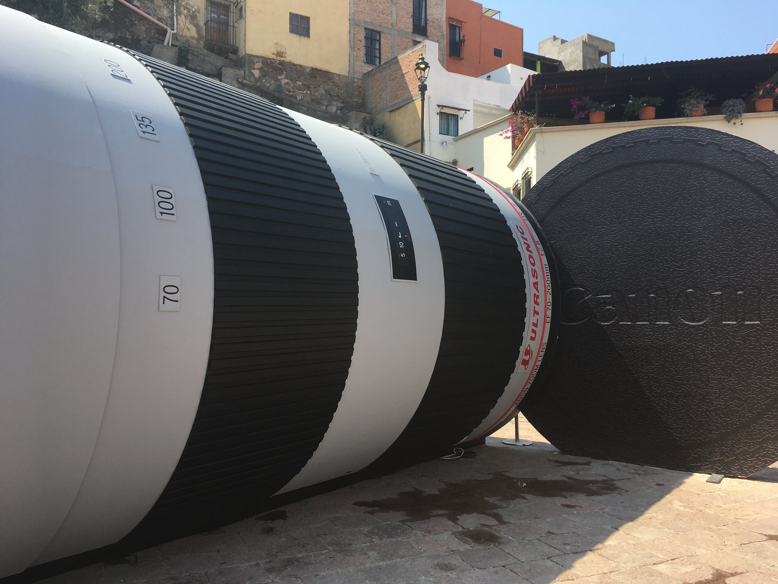
Guanajuato, Mexico. There’s something amusing about entering an exhibition that is also the object of the exhibition. This Canon lens is a good example of trade show meets environmental sculpture. The content is obvious (and surreal) from a distance.

We are all shrunk to insect size, including the vested guides (sales people.)

Enter the lens to look at the lenses. Look through the lens as if it you were taking a photograph of the town. A tube is a naturally perfect shape for signage, always at the right angle to the viewer.

The enormous lens cap texture, made in photoshop.
Slightly sunk into the pavement, it appears as if it was gently dropped by a giant.

The scale of “mimetic’ architecture is absurd and playful. Who can resist the urge to go inside a big toy?
Another cylinder, this beer can bar is not so enticing, perhaps because it’s more sunken and closed?

Dolores Hidalgo, Mexico. Nuestra Senora de los Dolores. On the steps of this church In 1810, the famous “Grito” of Miguel Hidalgo initiated the Mexican War of Independence from Spain.


I found this exhibit in the main chapel on a side wall. It’s a familiar display showing the actual size and development of a human fetus. It’s not the first time I’ve seen this exhibit in a Catholic Church, accompanied by similar text and surrounded by women.

In exhibition practice, how do we discern the difference between providing information or sharing a story, and engaging in propaganda? How does the visitor discern the difference? “Presenting facts selectively to encourage a particular synthesis or perception, or using loaded language to produce an emotional rather than a rational response to the information presented” is one definition of propaganda.
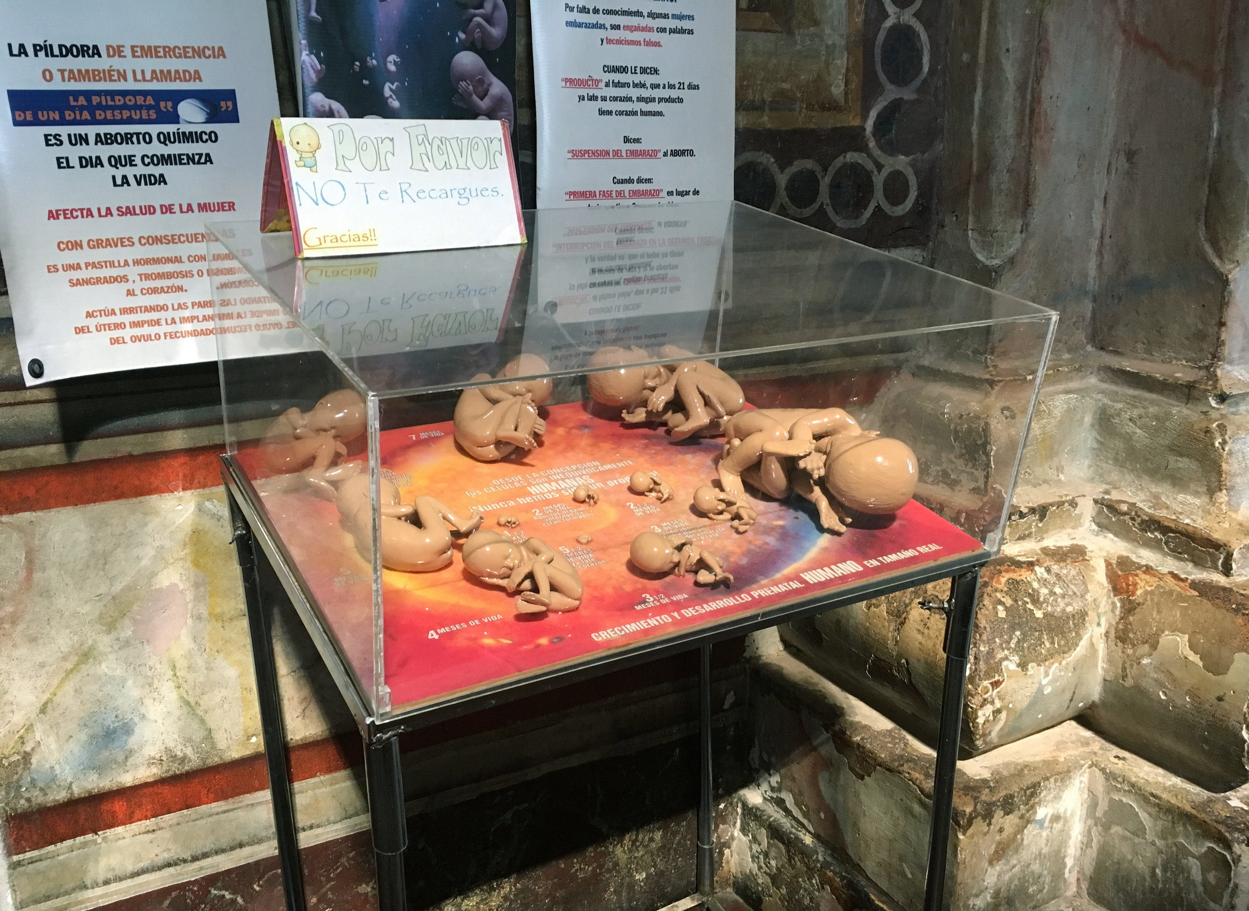
We’re all accustomed to biased or misleading information used to promote a particular political cause or point of view. From subtle to overt, propaganda is pervasive, coming from governments, activist groups, companies, religious organizations and the media.

In the museum world, there’s a healthy debate going on about “neutrality.” Museums as power institutions have never been neutral, but as educational institutions they’ve always pretended to be. To be relevant now, most museums recognize that they should at least be transparent about their own agenda. Why shouldn’t a science museum, for example, be active in the political fight for science? In today’s polarized world we desperately need factual information, and multiple real stories that reflect the complexity of our experience in the modern world. Learning is useless if it doesn’t allow dialog or fuel constructive debate. With the involvement of communities, museums can empower visitors to digest their learning; to express their concerns, reflect on their own thoughts and feelings about issues, and consider their own actions in the world.

Neutrality is an even harder question to ask outside the museum world. Governments, activist groups, companies, religious organizations and the media are all engaged in exhibition as narrative while serving the agenda of their institutions. Perhaps good transparent museums can provide safe places for us to learn how to be more discerning about propaganda?
Mexico City. El Museo Casa Estudio Diego Rivera y Frida Kahlo is just one of the many museums related to these two artists. Here, the first encounter is a living fence of cactus that appears to be the only security surrounding the buildings. I wonder if they have guards on constant duty?

There is squeezable space between the plants. But perhaps a living barrier naturally gets more respect.
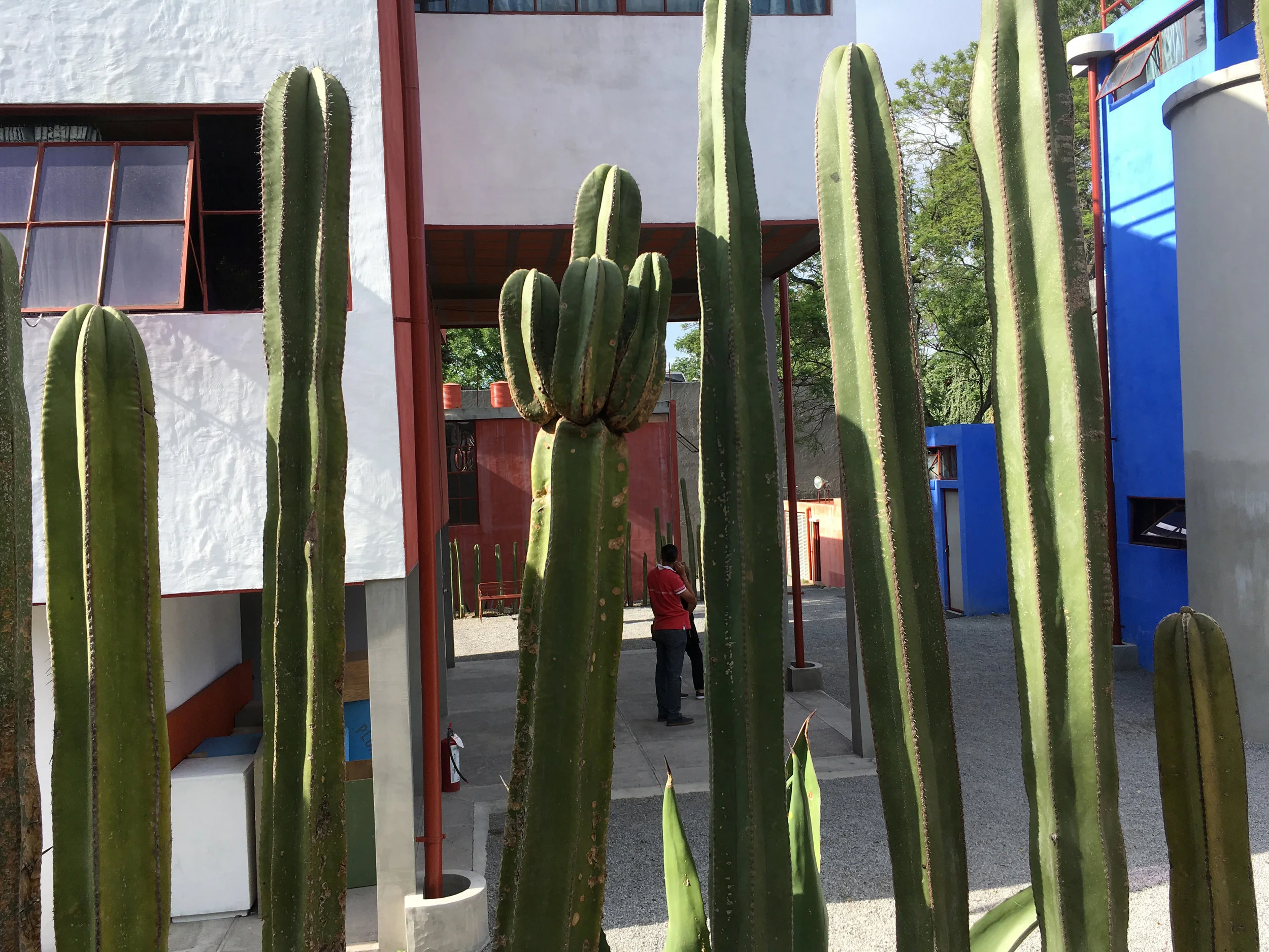
The cactus defines the small step down entry,

and divides the two main parts of the property, directing the visitor flow.

Everything surrounding this famous couple has a mystique, including this pair of side by side home/studios, connected by a bridge. But the functionalist architecture of Juan O’Gorman (1931) is so important here that most of the buildings are actually empty. Starting with a model at the entry, the visitor’s attention is focused on the historical significance of the architecture.

A portrait of the architect is used to block a no-entry room.


One of many characteristics of Gorman’s acrhitecture is his helical stairway.
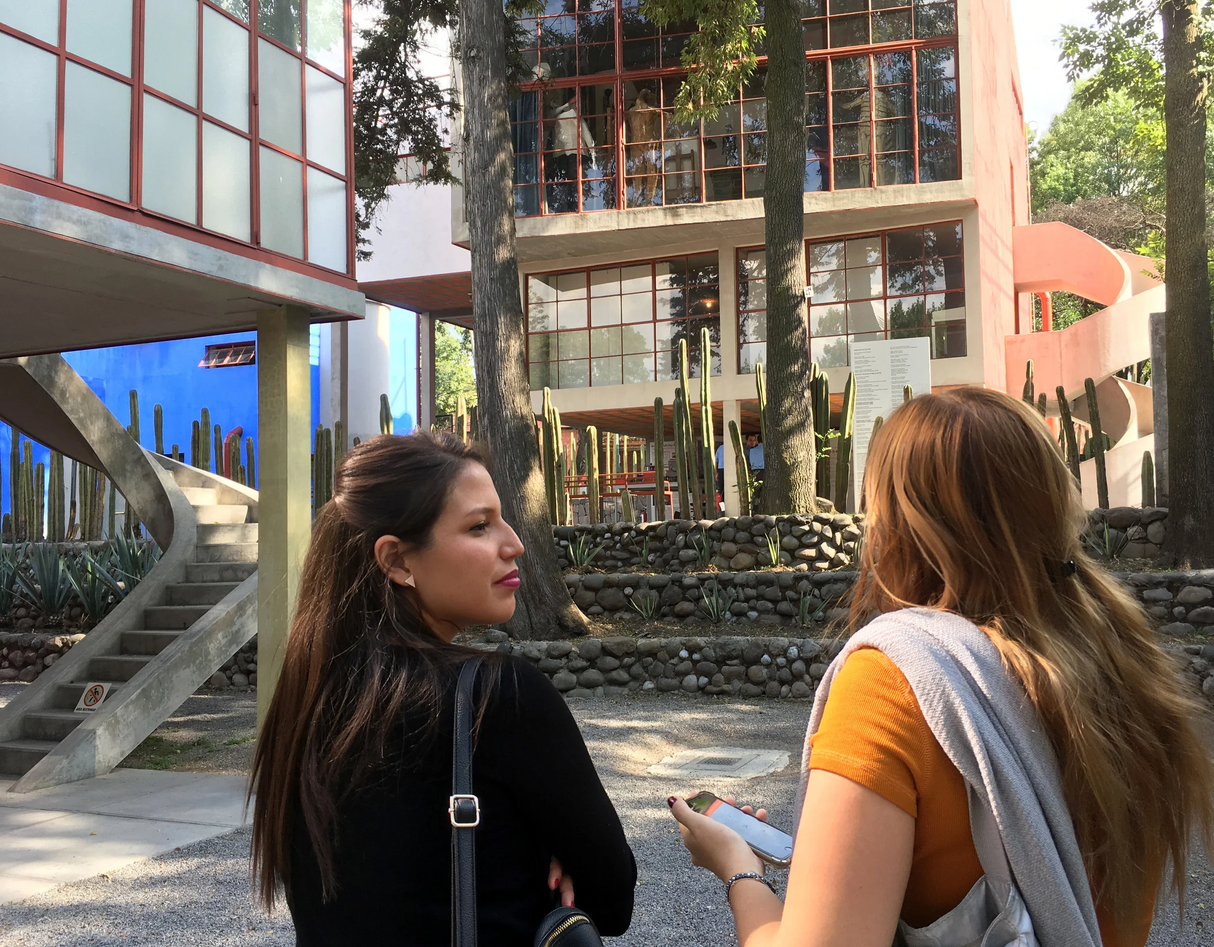

Architectural interpretation is provided as pull out, bilingual cards.

Panels cover the windows of this empty upper room, presumably to make it a usable exhibition space, currently unused.

Diego’s studio is the only “inhabited” area of the compound.


Seeing an artist’s work in the artist’s studio is like seeing an animal roaming free in it’s native habitat. The art, collected objects, inspirations, art supplies, furniture and the space itself add up to an integral whole.


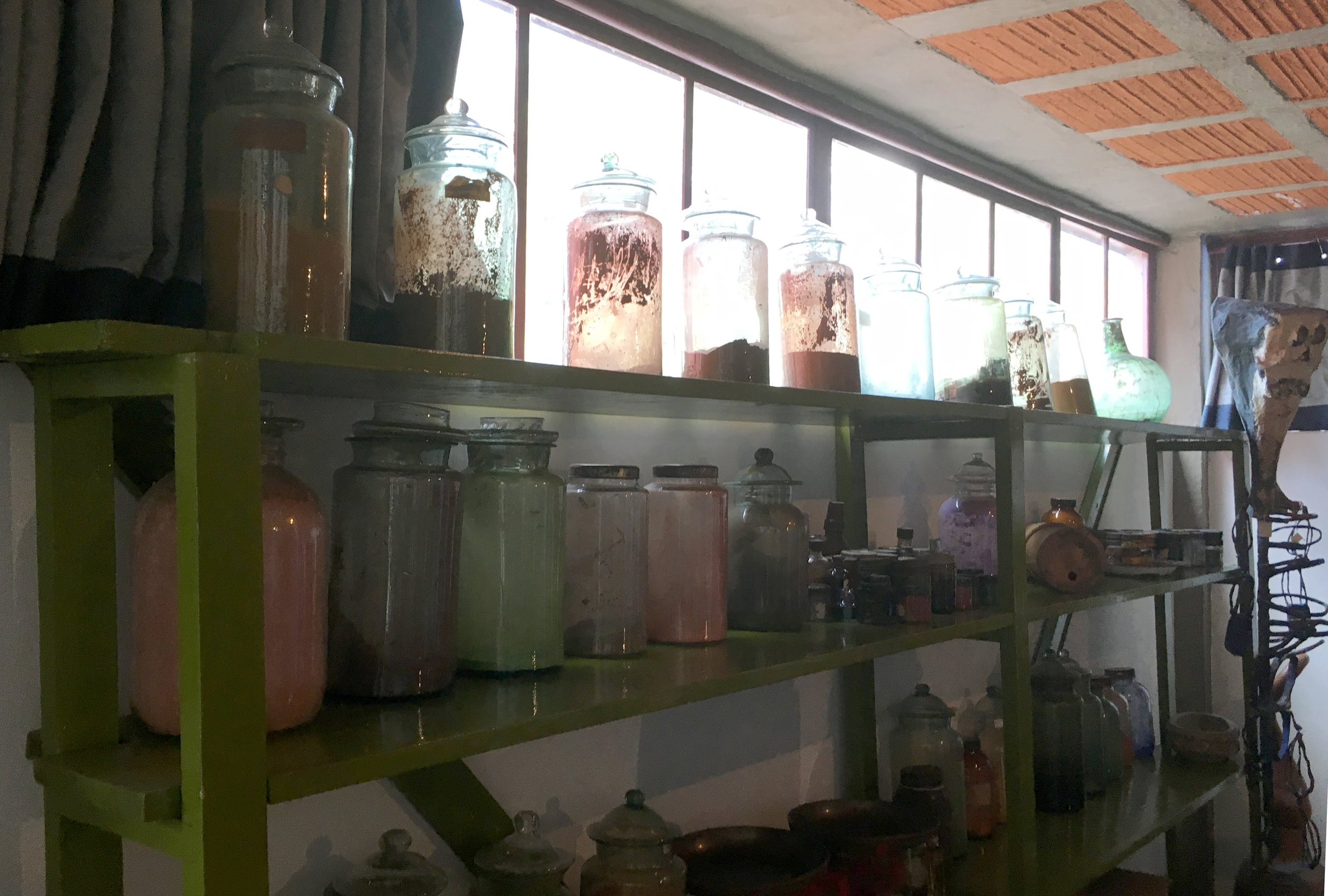
The studio gives the art a natural context, taking the pressure off labels, which are minimal.


Visitors are captivated by the feeling of a personal sanctuary. In that respect an artist’s studio becomes the perfect museum for their work.


In this tiny bedroom, Diego kept his pistol next to his bed. The floor symbol for “stand here” is a startling way to mark the artist’s death. Visitors are mostly reluctant to stand in the footprints, which seemed to be replicas of Diego’s actual shoes.

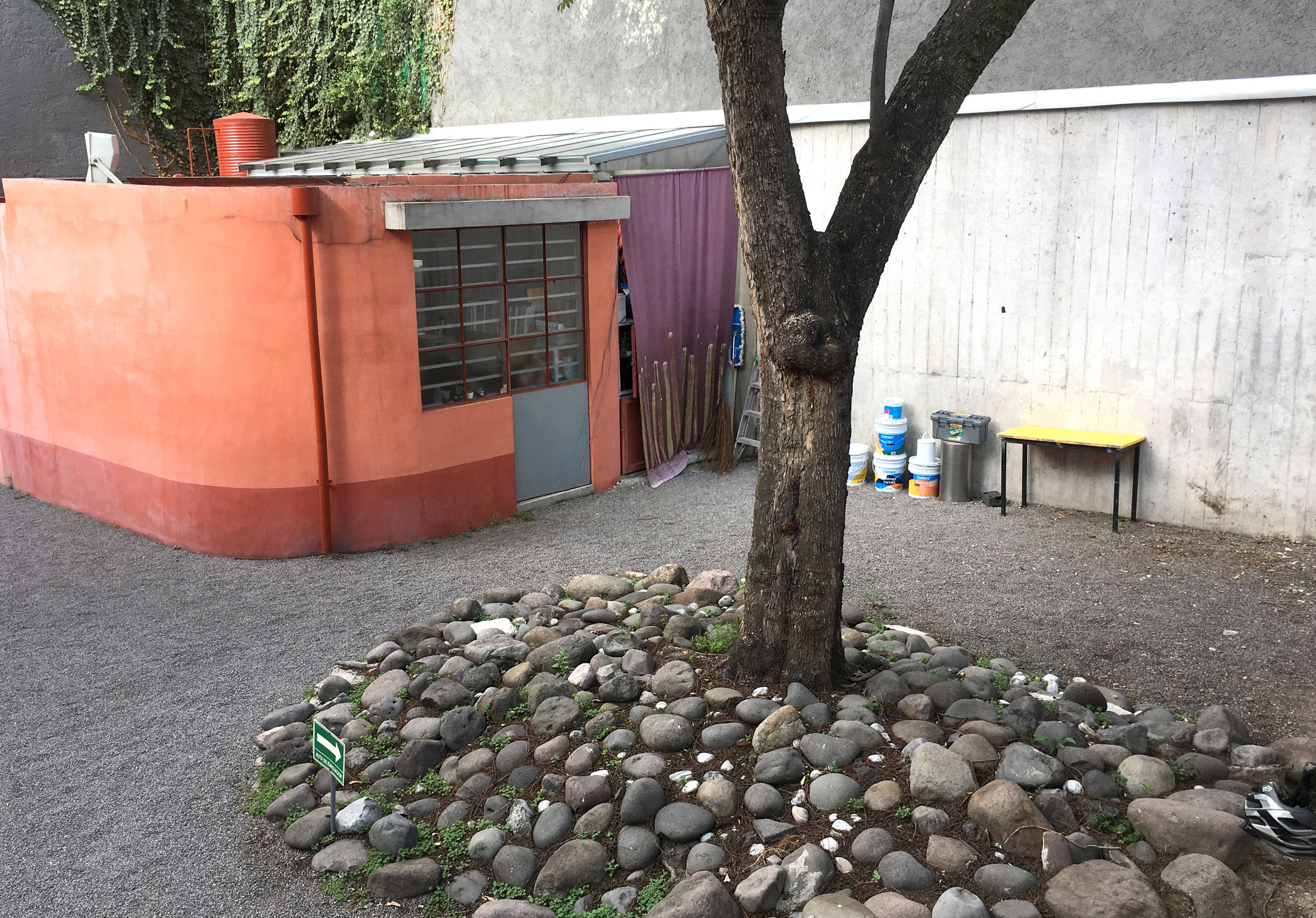
The small museum maintenance area is fully exposed, adding another, accidental tribute to the idea of “workspace.”


Likewise, open storage of exhibition furniture becomes noticable, as if it should have special meaning.



Mexico City. MIDE is an interactive science museum about economics. Although it was founded by the Banco de Mexico, MIDE prides itself on objectivity, valuing “relevance, inclusion, teamwork, information based on evidence and innovation.”

I heard about MIDE because May is Museum month.

Convent buildings (like this Convent of the Betlemites) make beautiful museums. Courtyard architecture enhances any building.

Such a beautiful space to gather in. Simply honoring the original architecture without dressing it up. Tasteful seating is all you need.

MIDE’s mission is to “encourage critical and creative thinking and the ability to learn to improve the well-being of all.” True to interactive science museums, their vision is to use economics, finance and sustainability “as a lens through which people can discover how the world works.” The entry message is that we’re all part of the economy. The museum’s target audience is 15-25 year olds.

My insufficient Spanish was problematic, but I managed to glean that there were various opportunities to customize your visit, your ticket with a photo, even design your own credit card. They are also focusing on future forms of payment, to enhance their history of money section.

There’s something awkward and redundant about ticket takers at a turnstile. They are like greeters but there’s no time to have a real conversation with them.

The donation box, and the store seems less self conscious in the context of an economics museum.

The first floor focuses on welfare, or well being, based on whether we are healthy, have a good diet, a roof, clothing and education. Peter Menzel’s photo series of families with their food is powerful here, introducing both culture and the aspect of choice, early on in the museum.


The second floor is about finances in society; all the activities that people, companies and governments perform to obtain, manage and save money in order to satisfy wants and need. Exhibits are in Spanish only.

I’m chronically uncomfortable with the bright, noisy aesthetic of many interactive exhibits. I’m rarely convinced that it’s neccessary to “force” the excitement on visitors as if they couldn’t find it for themselves. It reinforces an expectation that things that don’t look childish can’t be understandable.

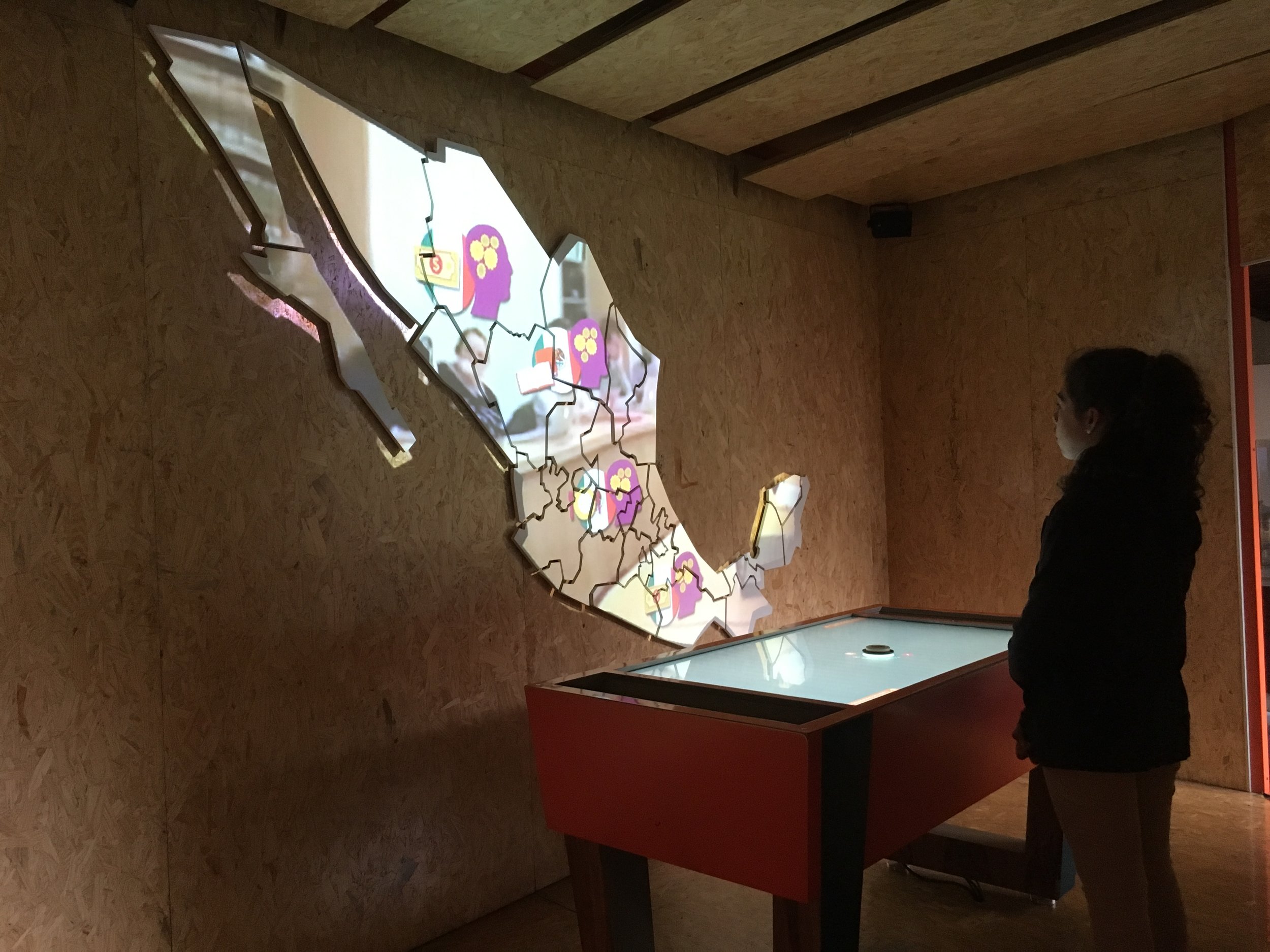
The “Market Simulator” room was empty when I passed by but usually it accommodates a group of 30 or so for a half hour buying/selling experience, using cel phones.

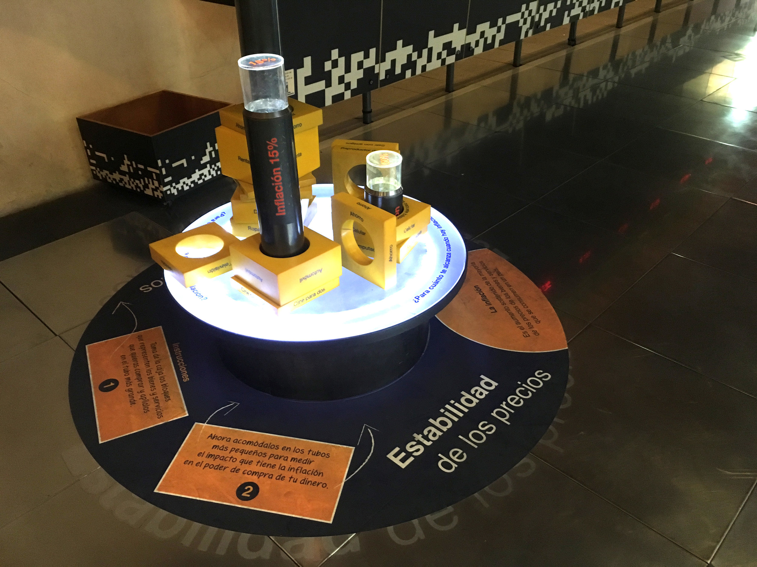
Here the products circulate around the room on a conveyer belt.


The third floor is about how economists study human behavior. People, families and society in general must decide how to use resources to meet our needs and desires. I liked the way each person in this story grid turns to face the one speaking.

They remain animated and seem to be actually engaged with the one speaking (center)

The fourth floor is about sustainable development, seeking a balance between economic decisions, welfare of society and care of the planet. All our activities have their beginning and end in nature.

An architectural mistake, a squeezable opportunity that visitors can’t resist.

It was harder to find truly interactive exhibits on this floor. But I found some bilingual elements, like this garbage podium that explains “The Story of Stuff” in English.
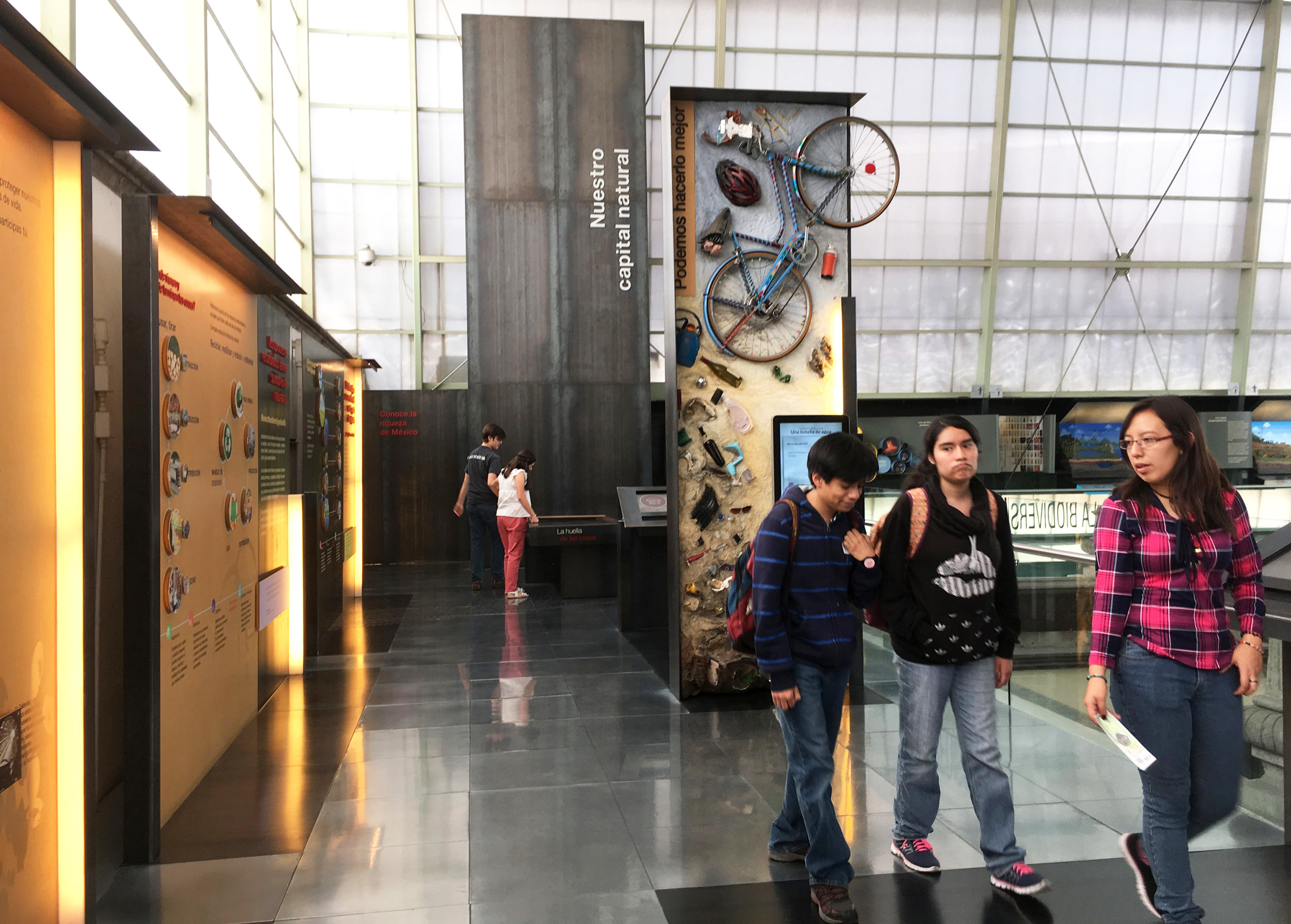
One example is the tire.


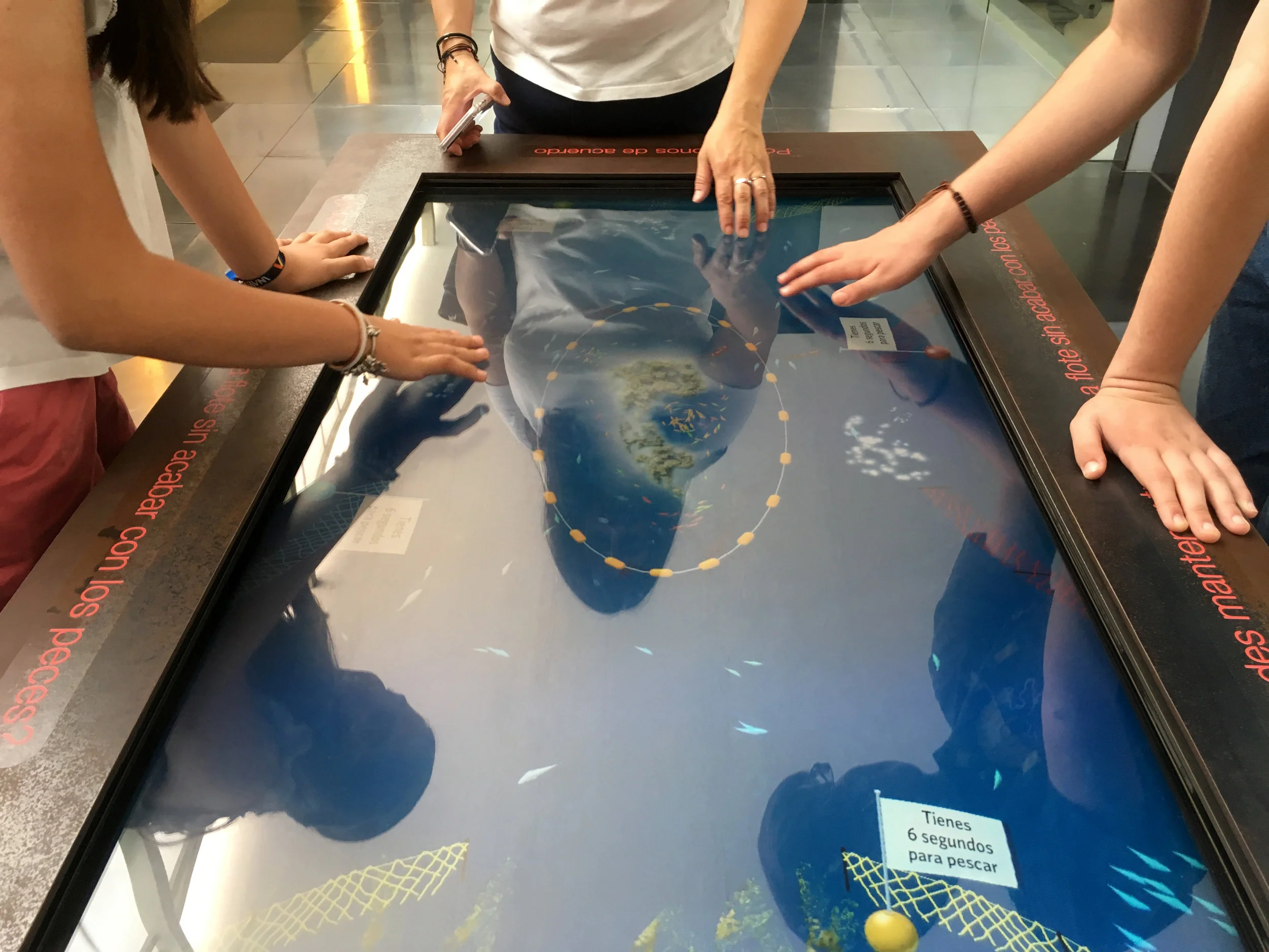
A very successful interactive was this table top adaptation of the “tragedy of the commons” concept using fishing. These three played (and discussed) for about 15 minutes!


Mexico City. Museo Casa del Risco. This was a stumbled upon surprise in San Angel. The covered central courtyard protects the lovely Fuente del Risco, constructed of plates and bowls and shells…
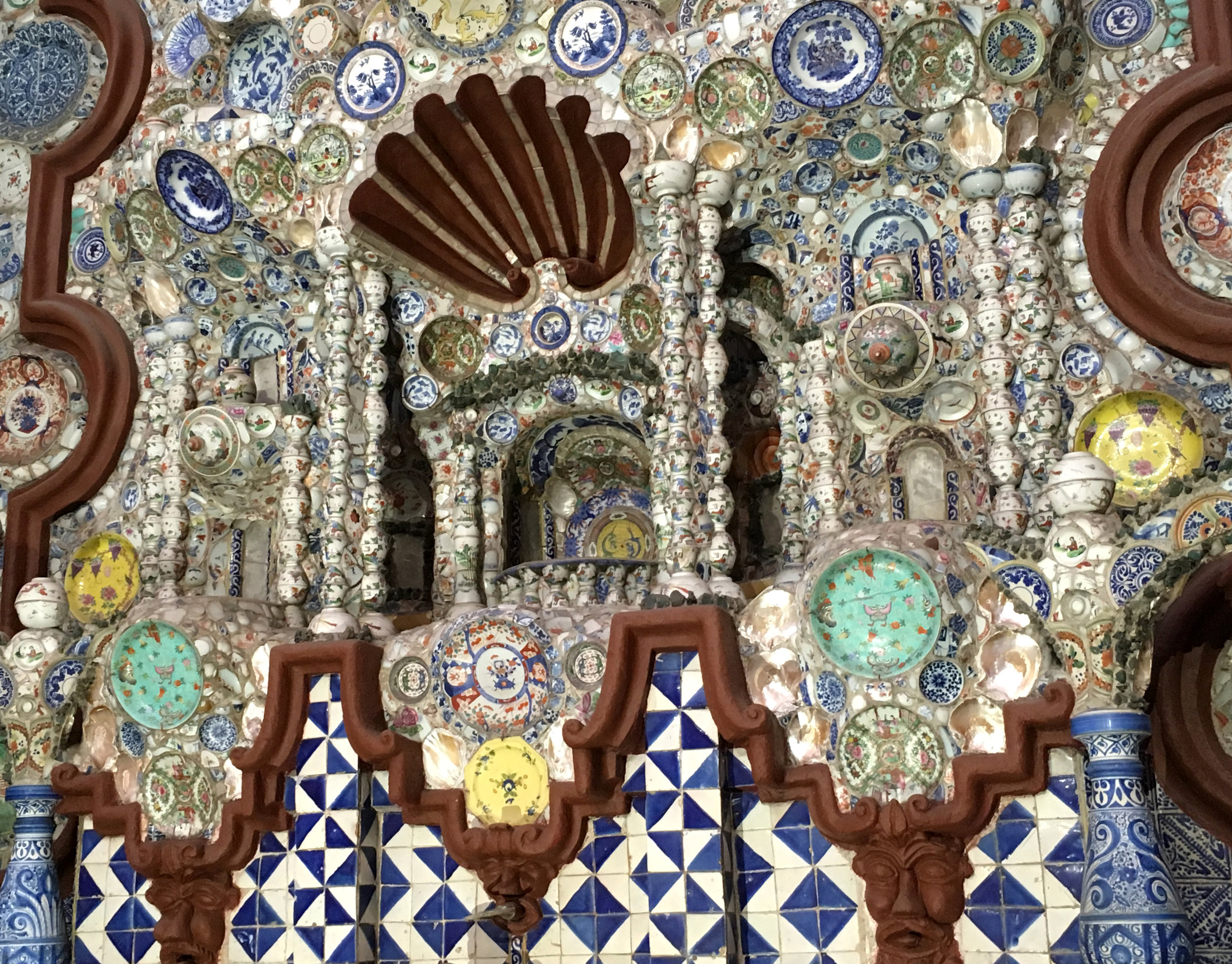
The alter-like fountain is the centerpiece of the museum.

While I was walking through the upper galleries, a projector, screen and seating were set up for a lecture…

Museum lectures have a reverent purpose and atmosphere. But museum venue design needs to be practical, typically using modular, generic elements that have no relationship to the place. The physical set up of the event space often seems like an awkward collision between the thing itself, and talking about the thing.

Mexico City, Mexico. Another way to stabilize street displays, using the weight of planter boxes


Mexico City, Mexico


Mexico City, Mexico




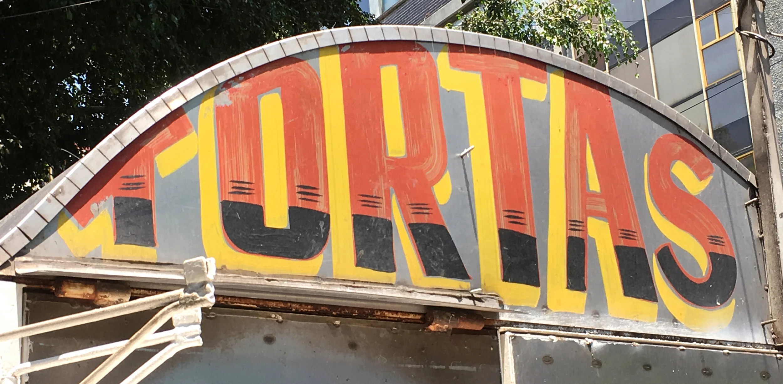
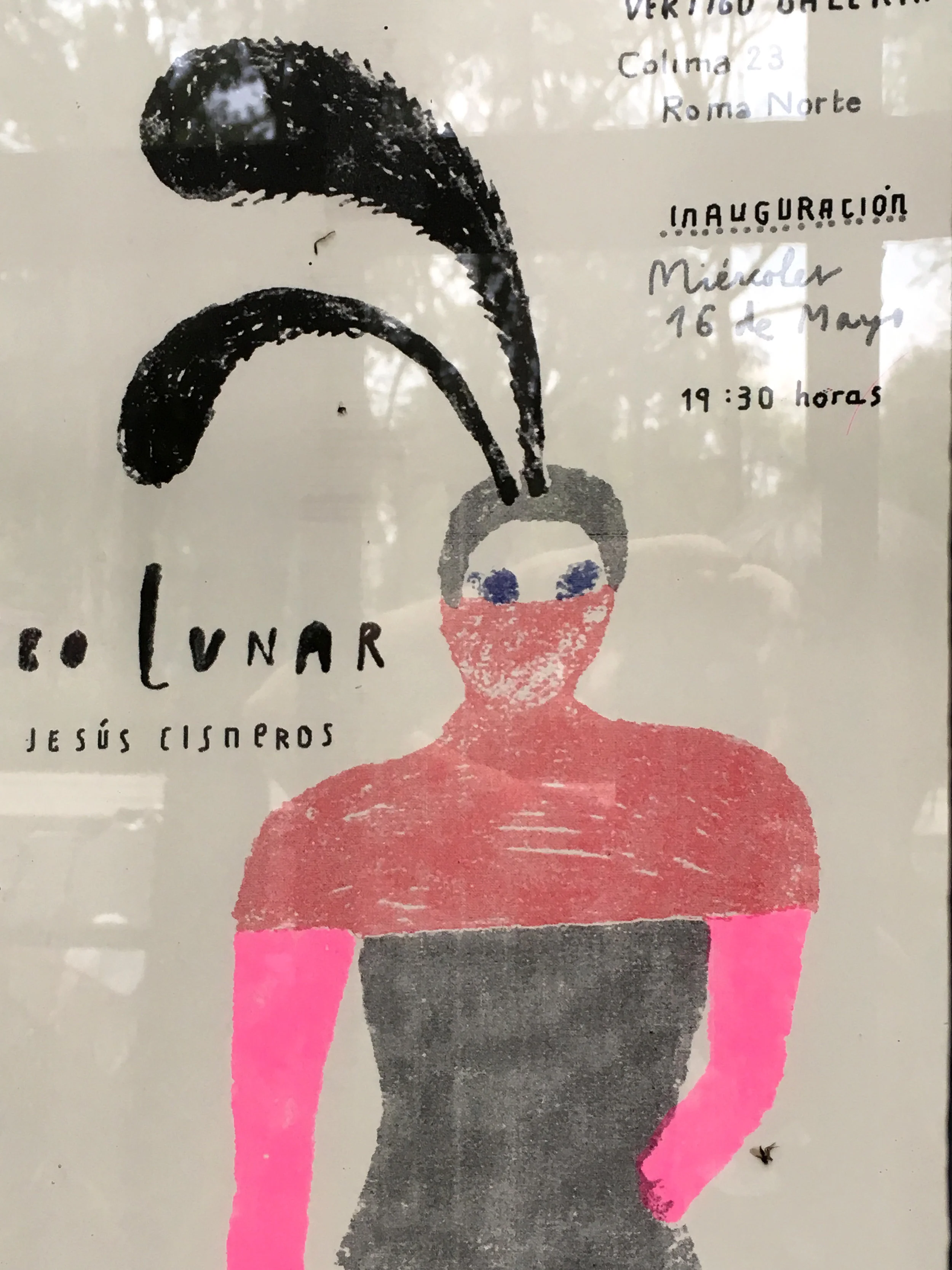
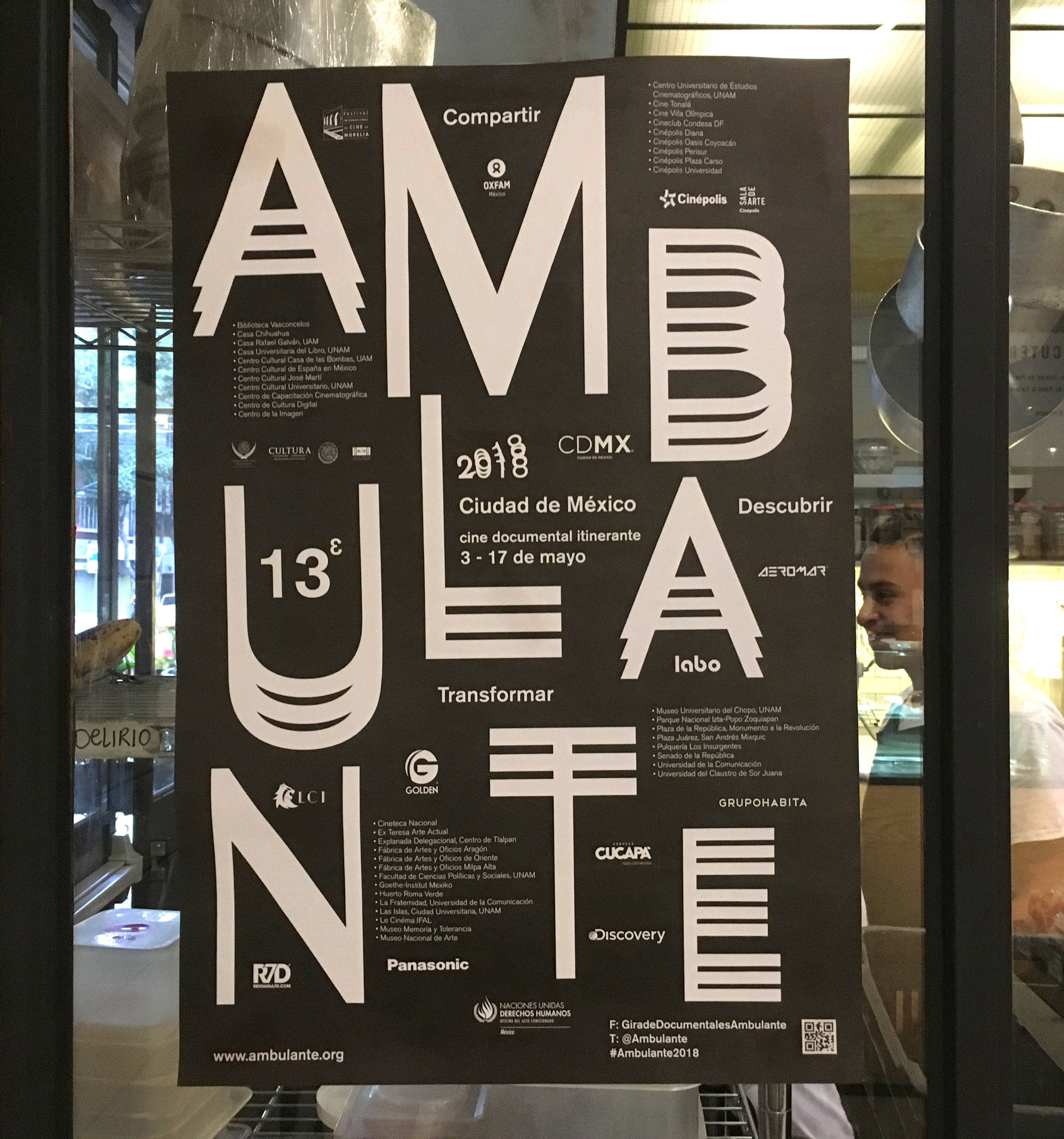


Mexico City. El Borcegui Museo del Calzado. Founded in 1865, the Borcegui shoe store has retained it’s old time ambiance.

Like many shoe stores, the entry passes between outside vitrines, where visitors can leisurely window shop before they enter the store.

Next to the store is an (almost) unmarked door that leads up a narrow stairway to the museum of footwear.

How appropriate that the most prominent indication of the entry is the scuffed up doormat.

The museum fills a single large room, enclosed by a partial balcony. The exhibition design, like the entry to the shoe store, consists of corridors of vitrine displays. But scaled to kaleidoscopic infinity.

As sculptural and functional objects we wear on our feet, shoes are infinately variable and fascinating. But like most large collections of a single object, the consistency of scale is monotonous. Presented like the shoes in the store entry but with less interesting angles, the overall environment is tedious and overwhelming.

Over exposure. Visitors are swimming in a sea of shoes, and some of them dart around nervously, scanning for highlights. Choosing which museum objects to focus on is like choosing what they might want to purchase in a store. “Browsing” to filter attention and save time is a shopping behavior that applies to exhibition visitor flow.


The breadth of the collection is truly amazing, although the curatorial sections are almost indiscernible, in the swirl of floating footwear. It’s an invitation to explore shoes from multiple angles; anthropological historical, scientific and artistic.


Regardless of the exhibition design (or lack of), everyday objects become extraordinary through the simple act of being placed on formal display. There is magical power in this, because everyone can relate to (in this case) shoes. An altered reality is created where visitors can marvel at common objects as if they were aliens who just landed on planet earth.


When the “owner” appears it adds a welcome dimension; shoes customized for the specialized feats of famous humans.


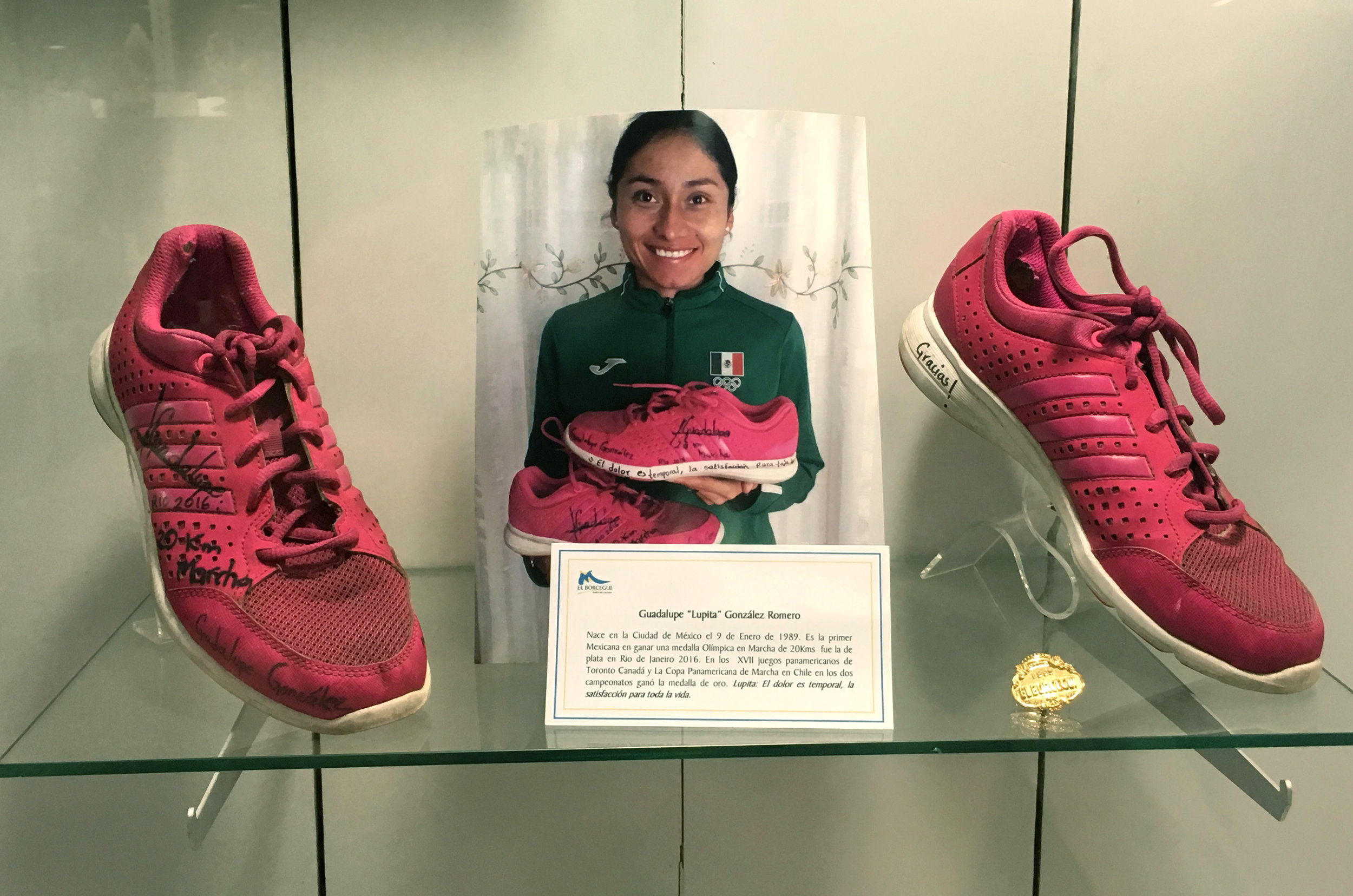

Messages written on the soul.

At last the balcony is a parade of baffling miniatures.

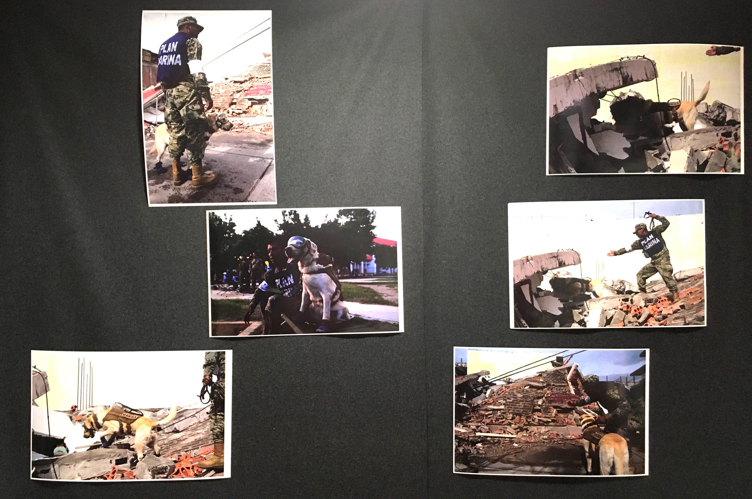
Beyond humans, the museum has made a connection to the famous rescue dog Frida, an earthquake heroine who wears blue booties. Fresh, locally relevant meaning-making.
