Hunger
One of my "misc" categories is food imagery, the craving expressed in large scale food photos.
One of my "misc" categories is food imagery, the craving expressed in large scale food photos.


London, England. A few examples


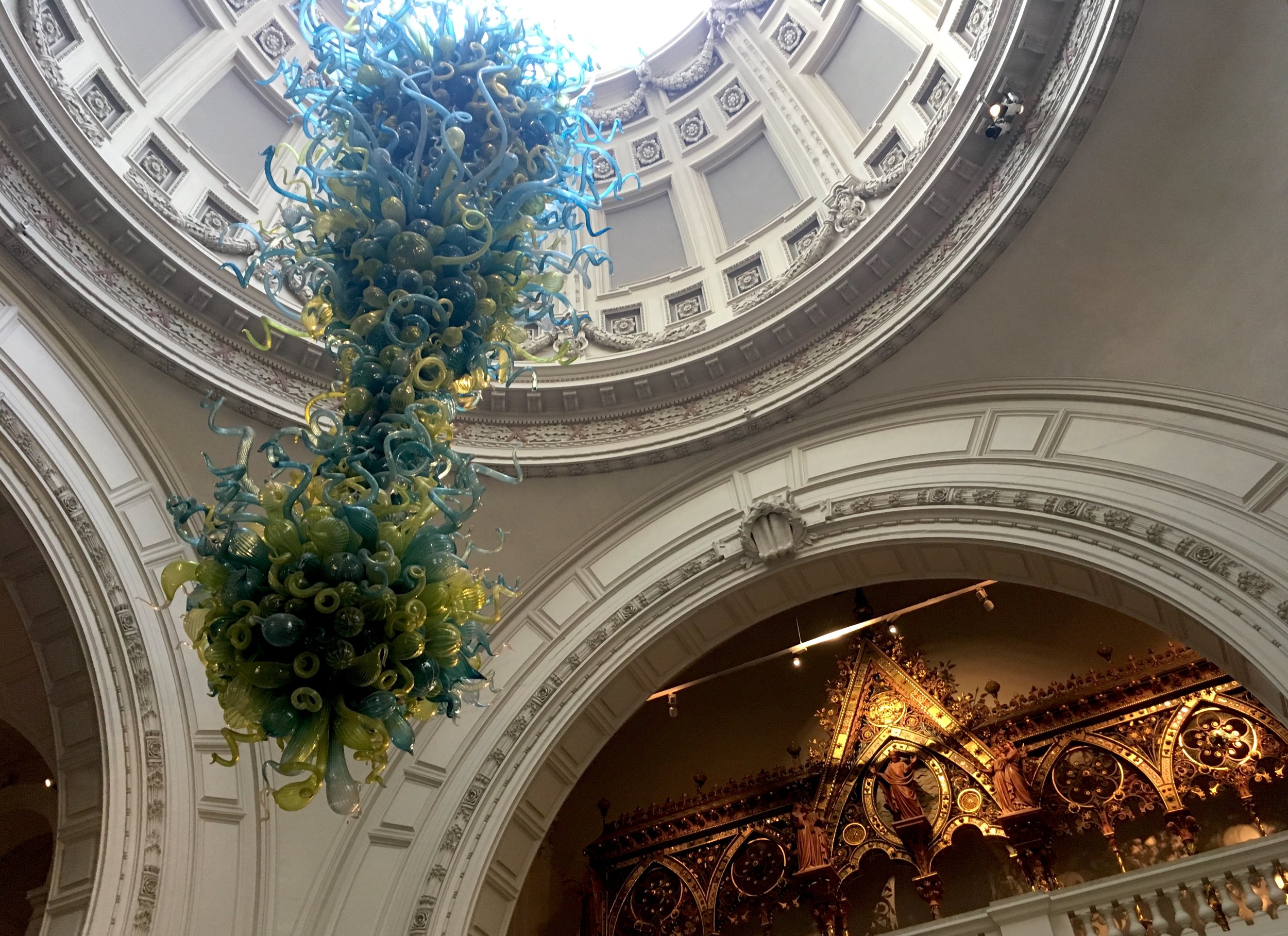
London, England. The Victoria & Albert Museum is a wonderful institution, with it's welcoming Chihooly hanging overhead and dramatic yellow lighting around the doors and reception island.

Signage has a way of taking over museum entries. With the good intent to communicate offerings to visitors, it tends to reproduce itself as a redundant effort. The more visual noise it creates, the more it escalates to compete with itself. This is painful to graphic designers, who understand the challenge and notice evidence of the struggle. The elegant reception island is getting covered with exhibition posters that already exist on monitors and free standing signs as well. What is the little green box...?

The original pool sign has given birth to a second, taller paper sign to reinforce and clarify the wading rules. Real behaviors were not predictable when the stone was carved, and the second sign is probably an ongoing prototype to get the best possible solution. Some believe that a paper sign is more effective, with it's "temporary" urgency. This awkward pairing is a common dilemma. Will they ever be re-united as a single final sign?

"Plywood, Material of the Modern World" is the current temporary exhibition, in a thoroughly red space.

Bent plywood entry walls seem to be fiberglass coated (?) surfboard style.

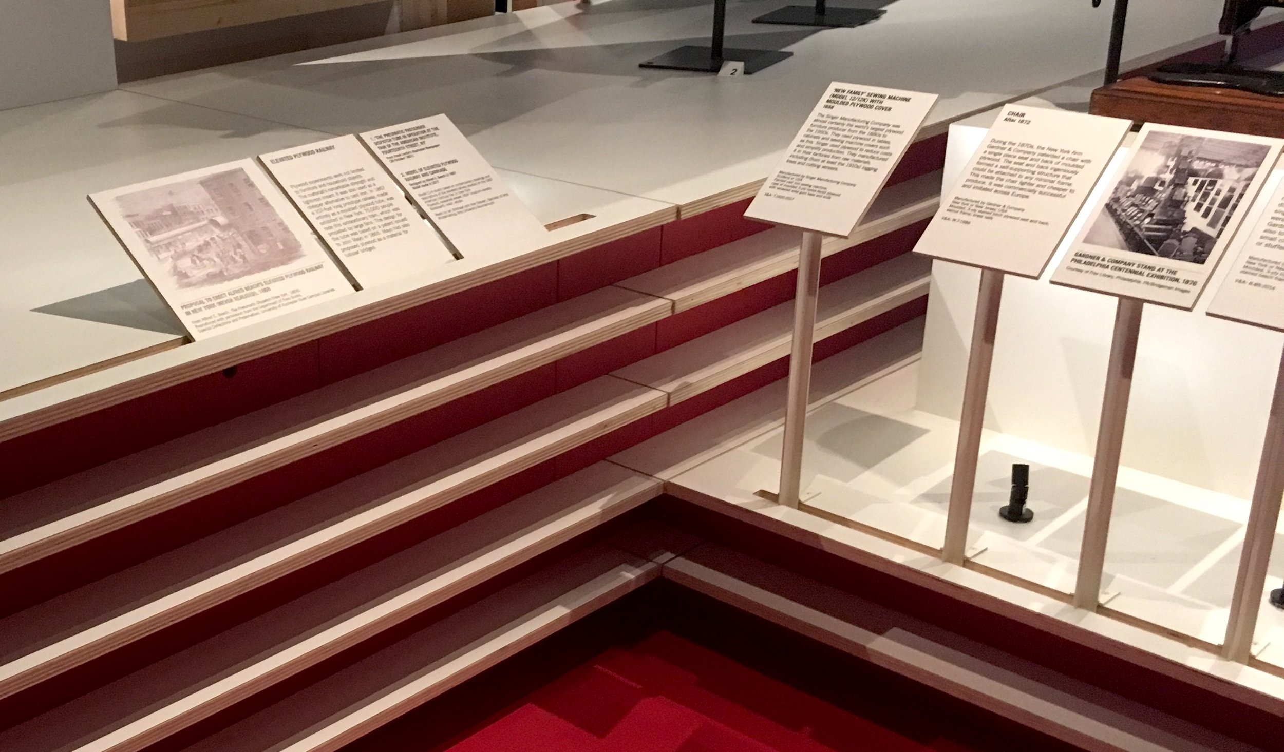
The exhibition design is layered, like plywood, with tiered pedestal bases, and engraved, standwiched area signs.


Explanations of the plywood process ring the big outer red walls, surrounding the objects in the center.


There's a jumbled rhythm between the 3D objects and 2D images on multiple plains.


A groove in the plywood to angle labels and insert small pedestal labels. Easy to position at the last minute, or reposition as needed during install.

A building alcove at the end of the space reveals plywood construction and doubles as a projection surface for videos on both sides, viewed from the corridor that circles around it.
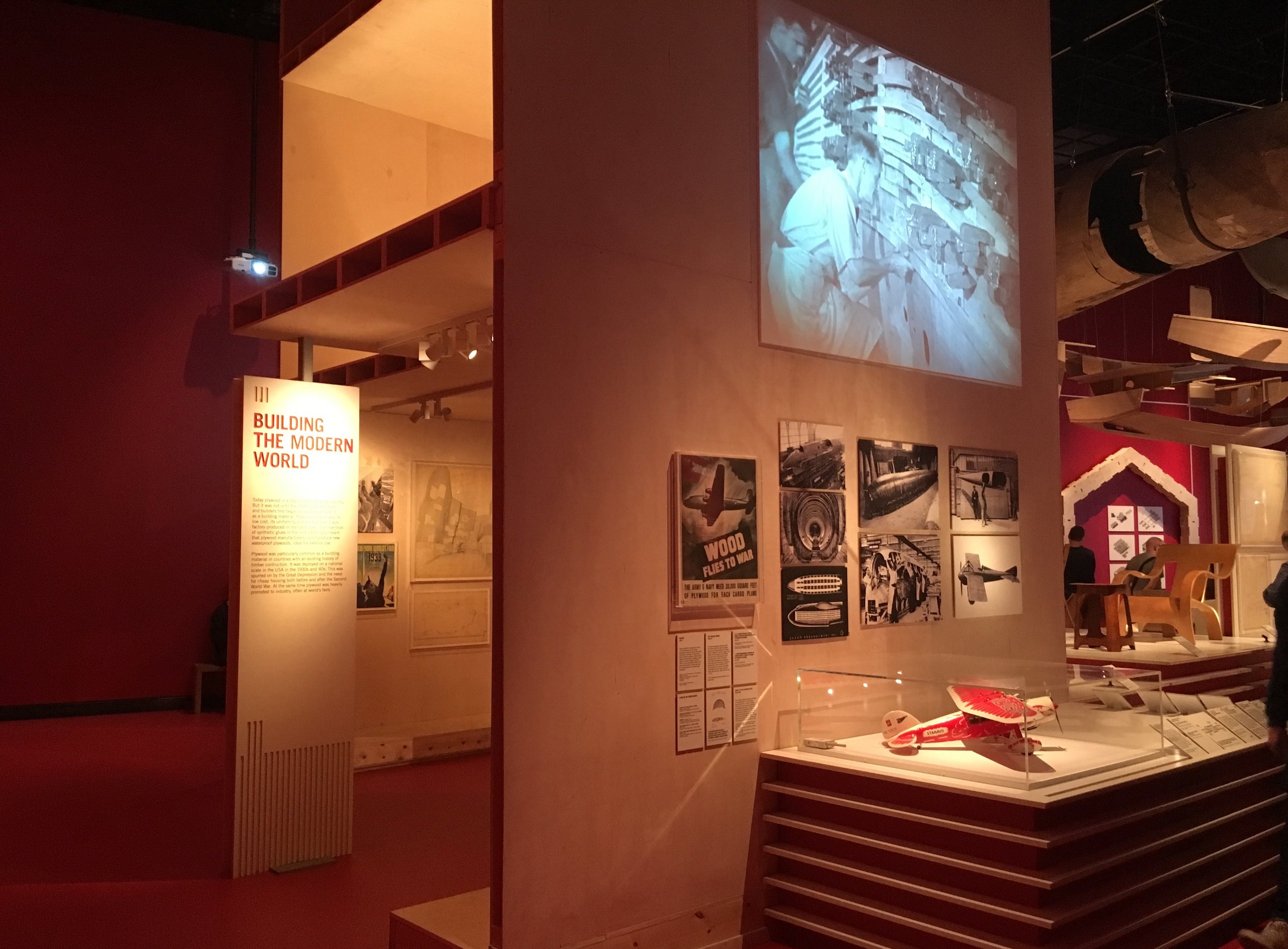


The space is rich with thoughtfully placed objects, from floor level up, into the airspace.


The exhibition extends out to the courtyard with ice skating shelters


The comfort of an iconic museum cafe cannot be underestimated, as the icing on the visit cake. The epic V&A cafe is a special place to reflect and recharge.


London, England. Photography is forbidden at some of the exhibitions I've seen, so I haven't posted them. I confess (apologize) that I took this forbidden photo of Marc Quinn's sculptures in the Soane House Museum. As figurative couple(s), fragments cast from life, they seem like the young guests at a elderly party, mixing uncomfortably with the crowd of classically modeled figures. A subtle tension. In dramatic contrast, a side room displayed their plastic moulds, bright pink and rubbery like birth cocoons.

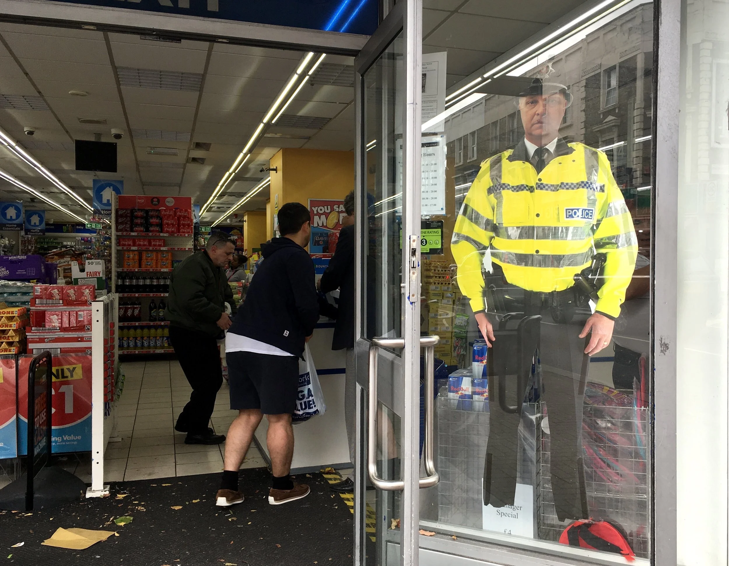
London, England. Like robots, graphics threaten to replace workers. Even without feet, this generic image has the "presence" of authority, and he's even a bit more menacing than a human being.
Busan, Korea. Although the whole world is our backdrop, many people line up at exhibit-like "Photo Zones", to take photos. Like this oversized postbox.


The most elaborate selfie op I found was this storefront, where people can step in, pose in front of a chosen backdrop for a series of shots, and walk away with a selfie flipbook.


Construction wraps are exciting, even magical. A few more examples (since Cambodia)... A plain fitted wrap with Christo-like beauty.
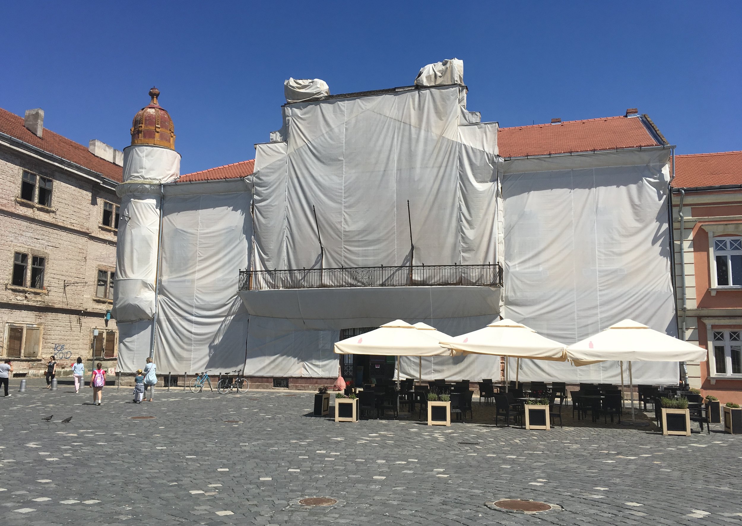
Photo wraps with an image of the concealed building are almost better than the building alone.


A wrap with a different photo leans toward surreal.
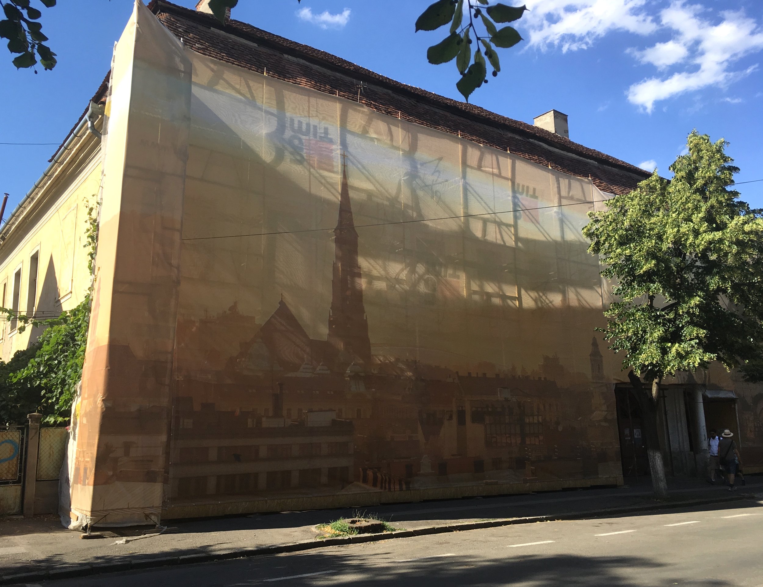
A graphic design wrap is the bright promise of modern,

or a future experience.

In Romania I lived behind this

with this view out

Construction sites are theatrical, setting the stage for the next act

The allure of "back stage" activity.

An intermission veiled by a curtain.

Dramatic, temporary architectural framing.

Construction oblivious of appearance.

A passageway between past and future

London, England. Design Museum. "California, Designing Freedom" looks at how politically rebellious attitudes (1960's—present) have shaped design.

"By turns empowering, addictive and troubling, California design is shaping the nature of the 21st century" This exhibition definately stirs it up.

The pastel colored exhibition design is organized by what you want; See what you want, Go where you want, Do what you want, Join who you want, Say what you want, Make what you want. The design didn't interest me, but the content made me feel homesick, in more than one way.

It's always revealing to see your own culture from afar. Here it was unsettling to see old and recent technologies side by side, with the same hopes and fears still attached to them.

From free speech movement punch cards to the Mobile Justice App, it all takes on new meaning in the current political climate. What seemed like a fresh struggle not so long ago is now seen as history, but history threatens to repeat itself.

In 1955, at Immaculate Heart College, a silkscreen studio for protest posters was led by Sister Corita Kent. Her work used advertising slogans, philosophy, street and store signage, poetry, scripture, newspapers, magazines, song lyrics, and political speeches.

The California garage as temple: Walt Disney's, Packard's, Job's, Wojcicki's

Google maps presented in layers of plexi panels

Historical graphic design included early issues of Wired and Emigre, digital fontwork,

and Susan Kare's sketches for Apple icons.


The graphic design of acid


More currently this advertisement by obeygiant.com and Amplifier Foundation, 2017

UCLA Mobile Justice App, 2015

Good Inc, animations and infographics intended to spur activism, 2016

USC Institute for Creative Technologies, VR to assess and treat veteran's PTSD

For sale in the shop

London, England. This is the permanent (free) exhibition at the Design Museum, in it's new location, under a hyberbolic paraboloid roof. The exhibition designer, Morag Myerscough, opens it with a colorful title wall that rotates the three words to tie the concepts together.


The three themes are perfect in their simplicity, and never boring. Political, economic and environmental issues weave between them. Triangular patterns are a visual theme.

The space is filled, rich with design examples


Black supports and yellow enamel labels define the modular design throughout. Labels can wrap counter edges, or fold under for angled wall or pedestal placement.


This counter cuts through a wall between two sections of the show.

On the other side, "Choice & Taste" is seeded with subjective terms which fuel visitor discussion. Some of the walls are panelled with acoustic cork.

The exhibition interpretation embraces the "inherent plurality of design" with open-ended questions and multiple points of view.

A central circular display area breaks out of the black for red.


Graphic eye candy. A delicious wall of Olivetti posters.

Nice reflections on the bright enamel area walls.


This museum seems to confirm that design museums/exhibitions have truly become mainstream destinations. The general public's awareness and design sophistication is impressive and truly admirable.

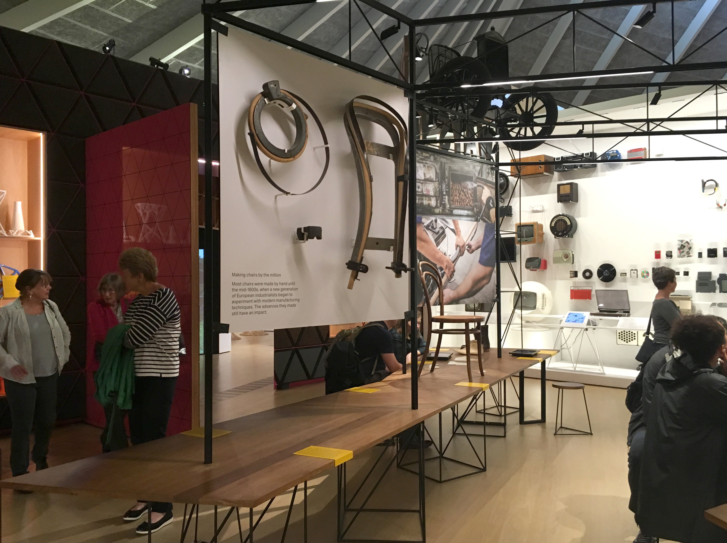
The maker area includes an activity counter with projects such as design a logo for your family, or a system for sorting waste at home.

I've always been uneasy with free floating "concept" words used as environmental super graphics. The ones that beckon us to PLAY (at the playground), or DISCOVER (at the museum) or CONTEMPLATE (on campus)... Typically they suggest either an obvious activity or a deep personal experience, things people can find for themselves (or not) without being told to do so. It seems to cheapen communication as well as the experience. If the goal is to inspire, why not use real poetry?
Decorative treatments like this hotel carpeting, are a continued appropriation of the same idea. Funnier, less insidious, but still not poetry (?)

And decorative treatments like these bus seats, more purely visual and abstract. More sophisticated, less literal, but still not poetry (?)

Paris, France. In my neighborhood, "Mon Voisin de Belleville"


We do not abbreviate.
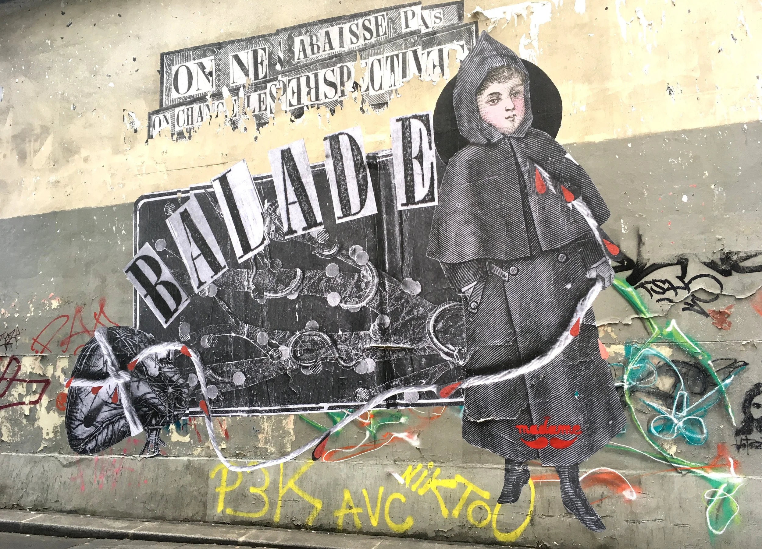
A series of tiny landscapes across the city

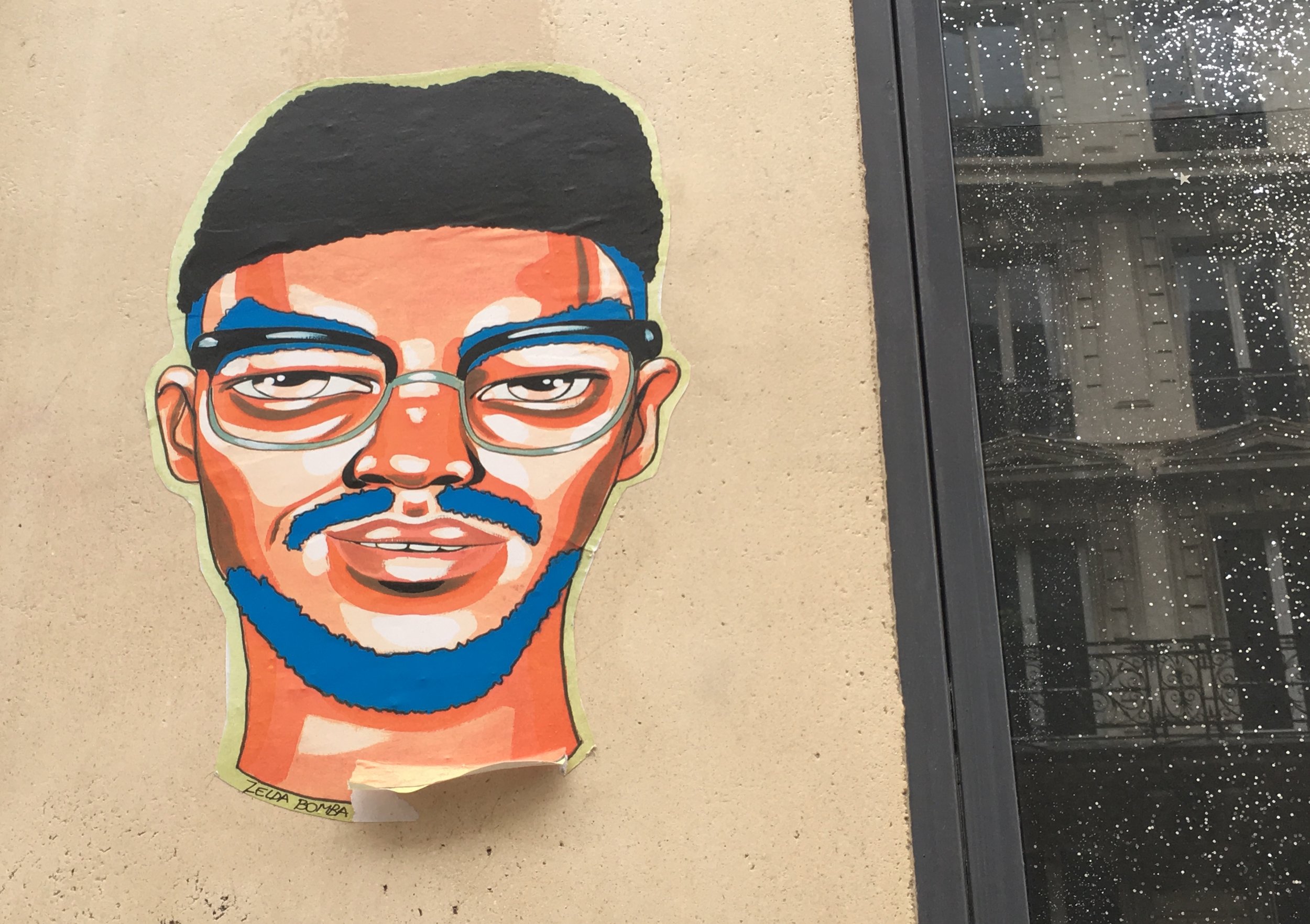


Paris, France. Some examples


It's still around.


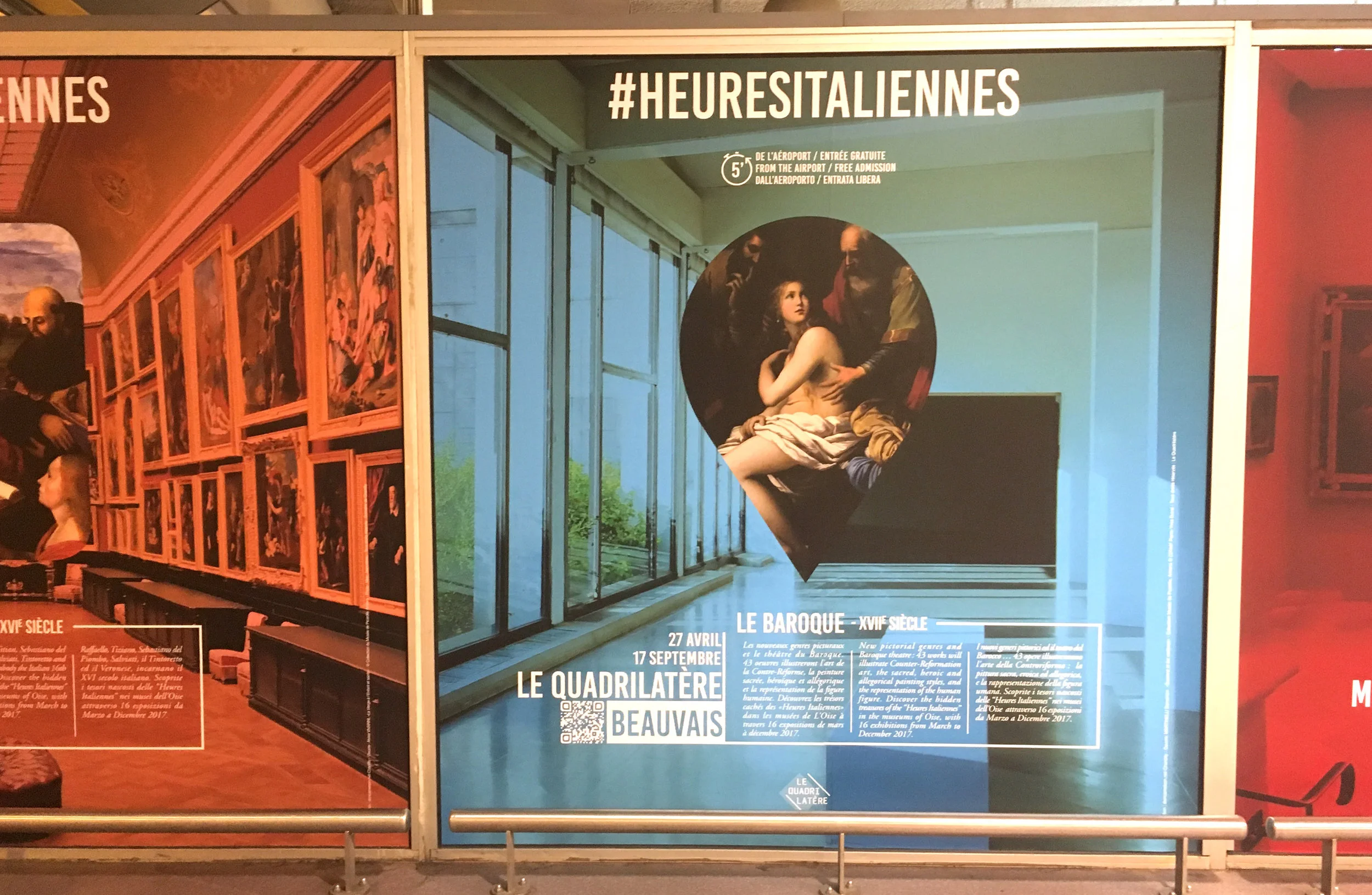


Paris, France. I returned to one of my favorite museums to see what's new. The design intent of the Museum of the Hunt and Nature is to be a "belvedere opening onto a wild space". Like a belvedere, they provide thoughtful and unexpected "views" of the human/animal relationship, mixing history with modern art.

The current temporary exhibition presents a group of artists in open-air-residence at Belval, a Hunting Park turned Nature Preserve, exploring the relationship between landscape as a symbol and territory as the place where we actually are. The exhibition entry is a step up overlook onto a idealized painting.

Each photo in this series is fixed at an angle, not hinged or movable. The angle shifts gradually across the wall, from the story side most revealed to the image side most revealed.


The same set of cards is provided separately, so visitors can see both sides of all of them, but the partial wall mounted views are more intriguing.

These take away sheets are padded, wall mounted.

A darkened area shows eerie night camera footage, projected on gauzy double layer fabric. The occasional breaking of a twig underfoot heightens the attentive mood.


A sandy corridor is hushing, because visitors automatically fall silent as they pass across this surface.

A discussion beautifully captured, and the rest of the story on plates.


Hardware and wayfinding are beautifully integrated in the main museum.


Each animal has it's own cabinet, with content neatly organized by shelf, drawer, sliding panel or viewer. The typography is burned into the wood surfaces. These cabinets honor the prey on the same level as the hunter.


Multi lingual panels hang on a wall hook in each room. A fox sleeps on a chair...

...and another brilliant way to say "Do not sit", with a thistle instead of a sign

Throughout, the house, animals roam freely, sometimes observing visitors.

Modern art is incorporated throughout, from subtle to overt, expressing the visceral feeling of the wild and points of view from macabre to humorous. Overall the art equalizes the reflection between animal and man. Like this poignant video of a unicorn in the rain

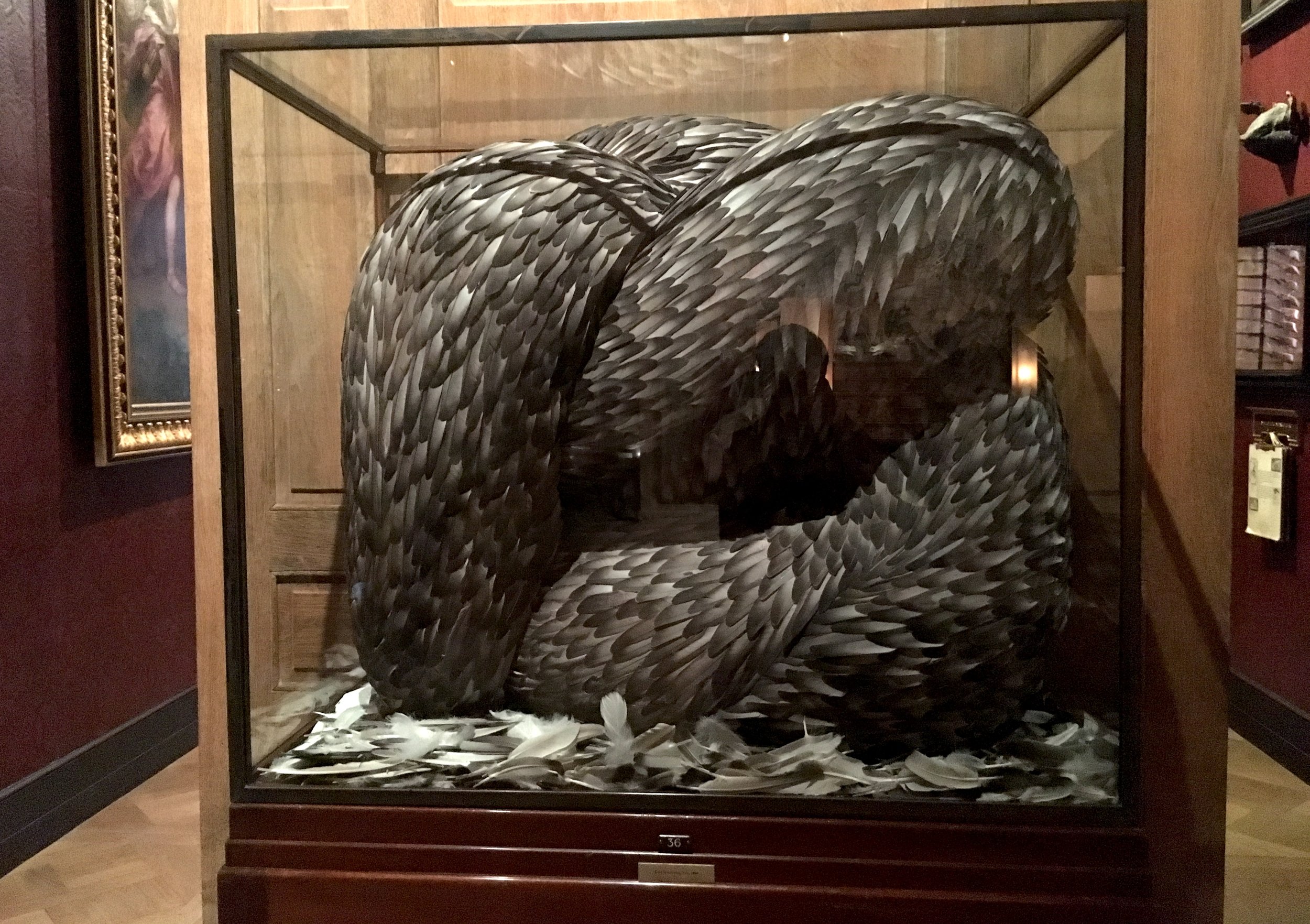
And this big coiled feathered serpent.
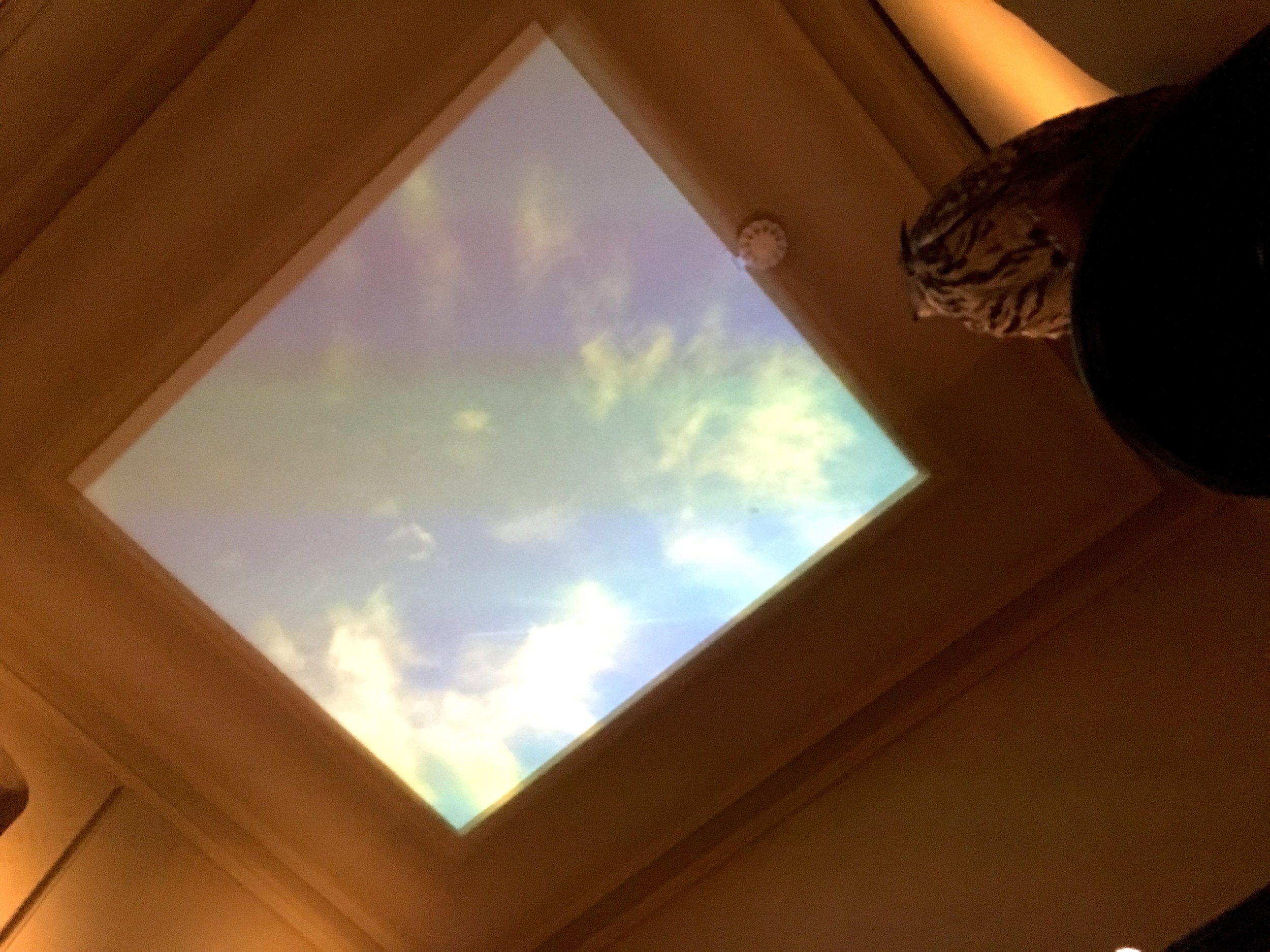
A video of the sky, with an occasional falcon flying past, crying out.
Artists' labels are distinguished by background color only.

The modern art perspective provokes visitors to observe the traditional collection more vividly, like these sculptural bird calls...and falcon hoods.


And raises questions about pets (tame animals) as co-hunters and the crossover role of apes. The museum seems willing to recognize the savage and the tame in all of us.

Menacing wallpaper.

An unmakred button outside the trophy room makes the boar's head speak, or I should say grumble, incoherently.
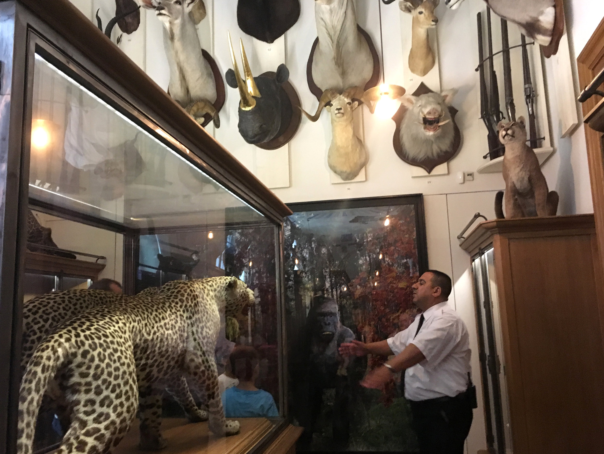
Signage/interpretation is so subtle and physically integrated here that it drops out of awareness, or falls into a deeper one.


The use of a reflective material in this word reflects both inner and outer nature.

Paris, France. Popular with tourists, this quaint store, which looks like a museum, is actually a store for museums. Since 1831, the Deyrolle family has been selling specimens and taxidermy to natural history collections. They preserve only animals that have died naturally, and are committed to protecting natural diversity and endangered species.

The visitor/shopper will find a mix of natural artifacts for sale, and not for sale displays.

What is the relationship between visiting and shopping? In museum stores, we might buy a catalog or memento as a physical reminder of the personal meaning of the exhibition experience. Many traditional museums are showcases of what (only) the wealthy can buy or commission. As the natural world becomes more endangered (valuable), perhaps we're looking for something to "save", a memento of vanishing life?

Visiting is purely an act of appreciation, but shopping is an act of materialism. At a museum we enter as a visitor and we'd be shocked if something was for sale. At Deyrolle we enter as a shopper, but some things we're not allowed to buy. Reverse dynamics heighten the tension between respect and aquisition.

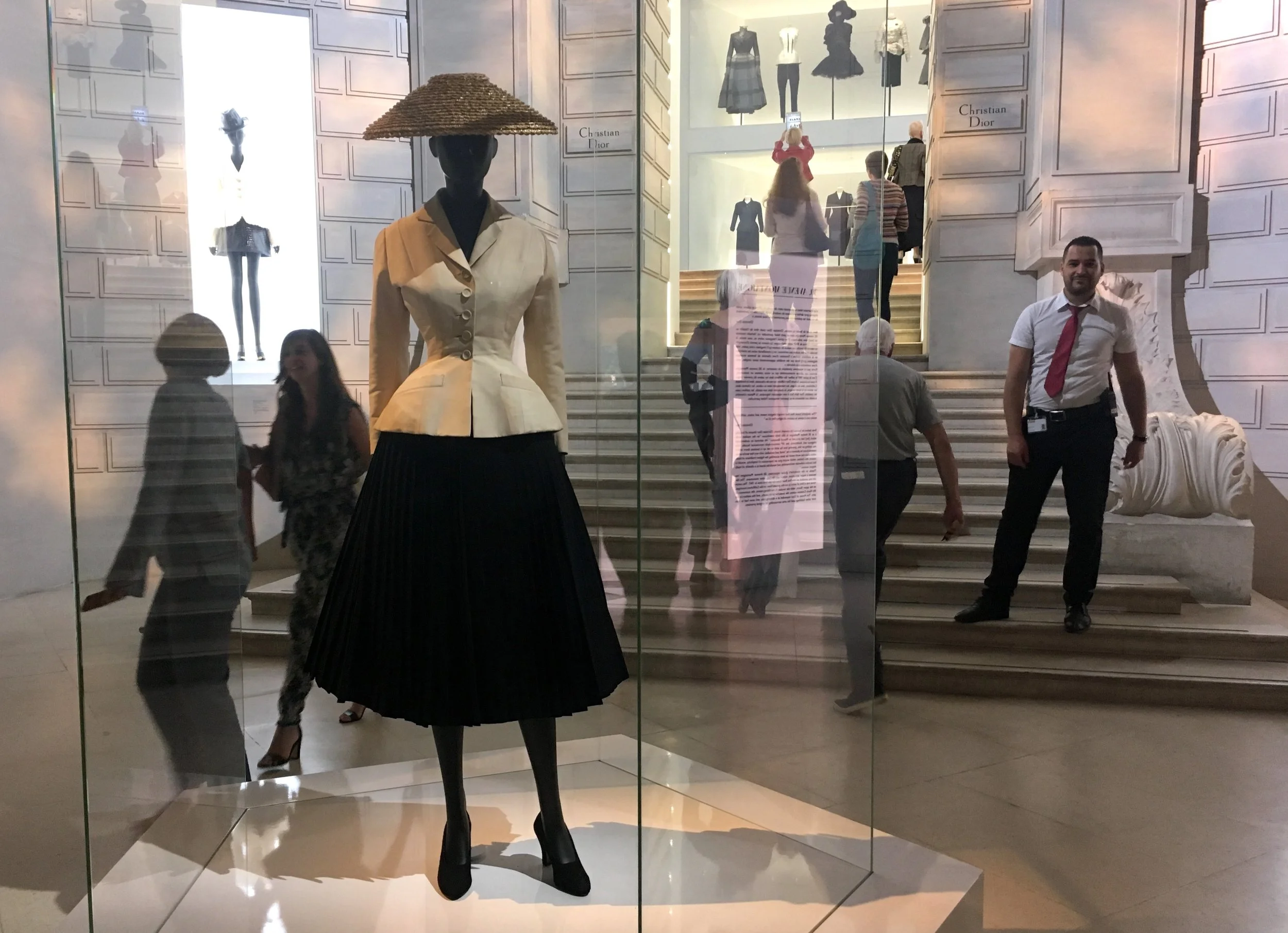
Paris, France. The entry line was down the block to get into the Christian Dior exhibition at the "other" Louvre, Musee des Arts Decoratifs. On my last visit to Paris I discovered how interesting fashion exhibitions can be, in a city where it's elevated to the highest art. It turns out that Dior was connected to other arts as well, and I had much to learn.

The exhibition is organized in 2 parts straddling the main entry, each side entry with a grand architectural theme. The initial effect was like a glamorous shopping mall.


But the smaller, actual entry, at the top of the stairs, was really interesting. After passing through a transparent "house" of Dior...

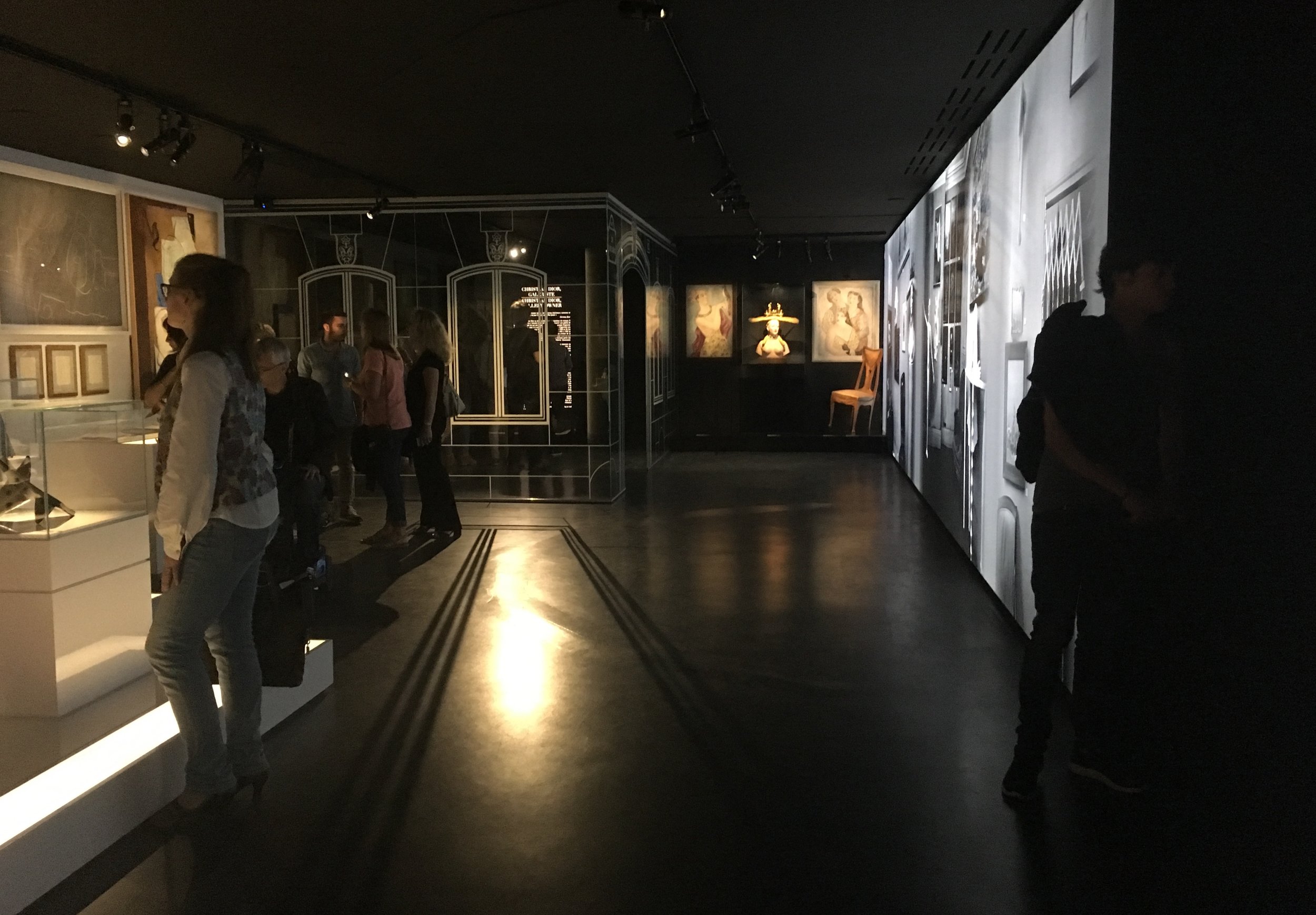
The connection to art is immediately made, with a black & white photo mural of the art gallery Dior once owned, before he became a fashion designer.

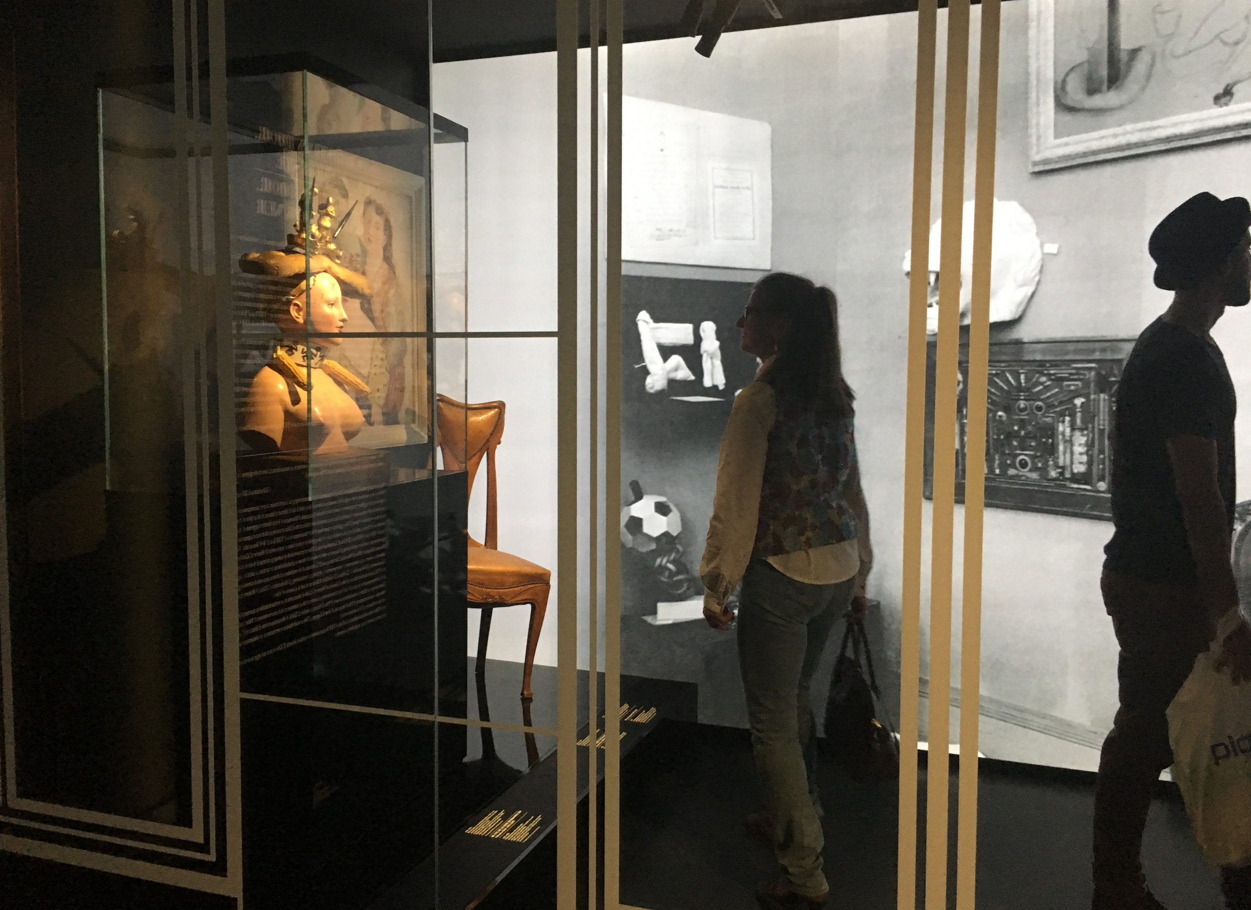
This sculpture becomes iconic with it's prominent placement.

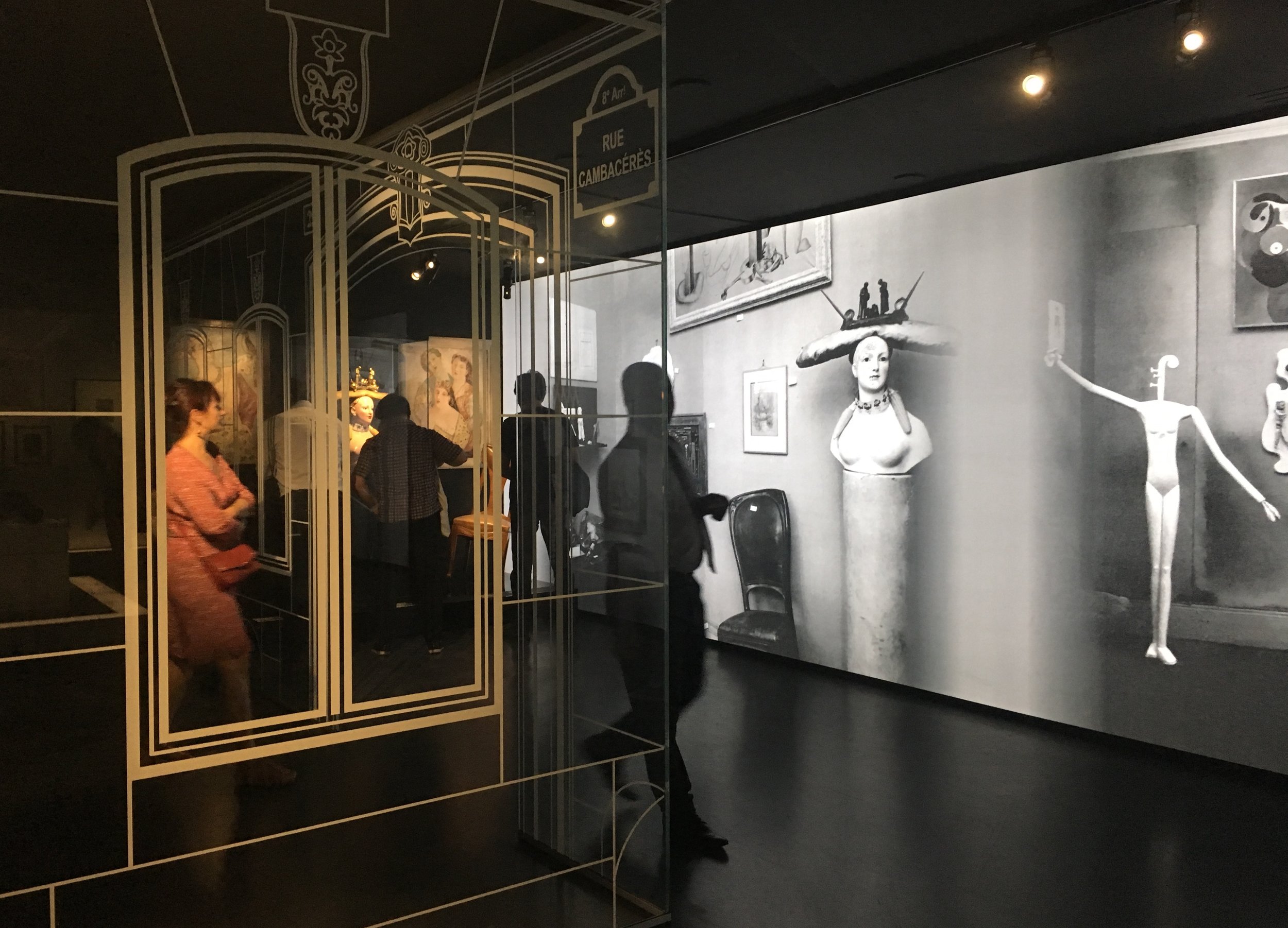
Dior was closely connected to the surrealists who showed in his gallery, and whose work was also on display here in the exhibition. A nourishing dose of art before digging into fashion.
After Dior's life story is a gallery honoring another art, fashion photography. The photos were displayed traditionally on three walls. But on the fourth was a set of three big vitrines with the light fading in and out to reveal the actual dress in the space behind the enlarged photographs. An interesting play between image (woman) and object (dress).


What follows is a dense winding pathway of outfits and accessories, organized by color. I was amazed by the small, foot-high models of outfits, perfectly sewn in every detail! Visitors were moving very slowly and clearly relishing every detail.


Like food, fashion has an intrinsic allure, so personal...

The effect of this collaged path was deeply feminine, precious and cool.

The stairway leading down passes a wall of magazines

Historically inspired designs look out on the gardens

Culturally inspired designs are shown with related paintings
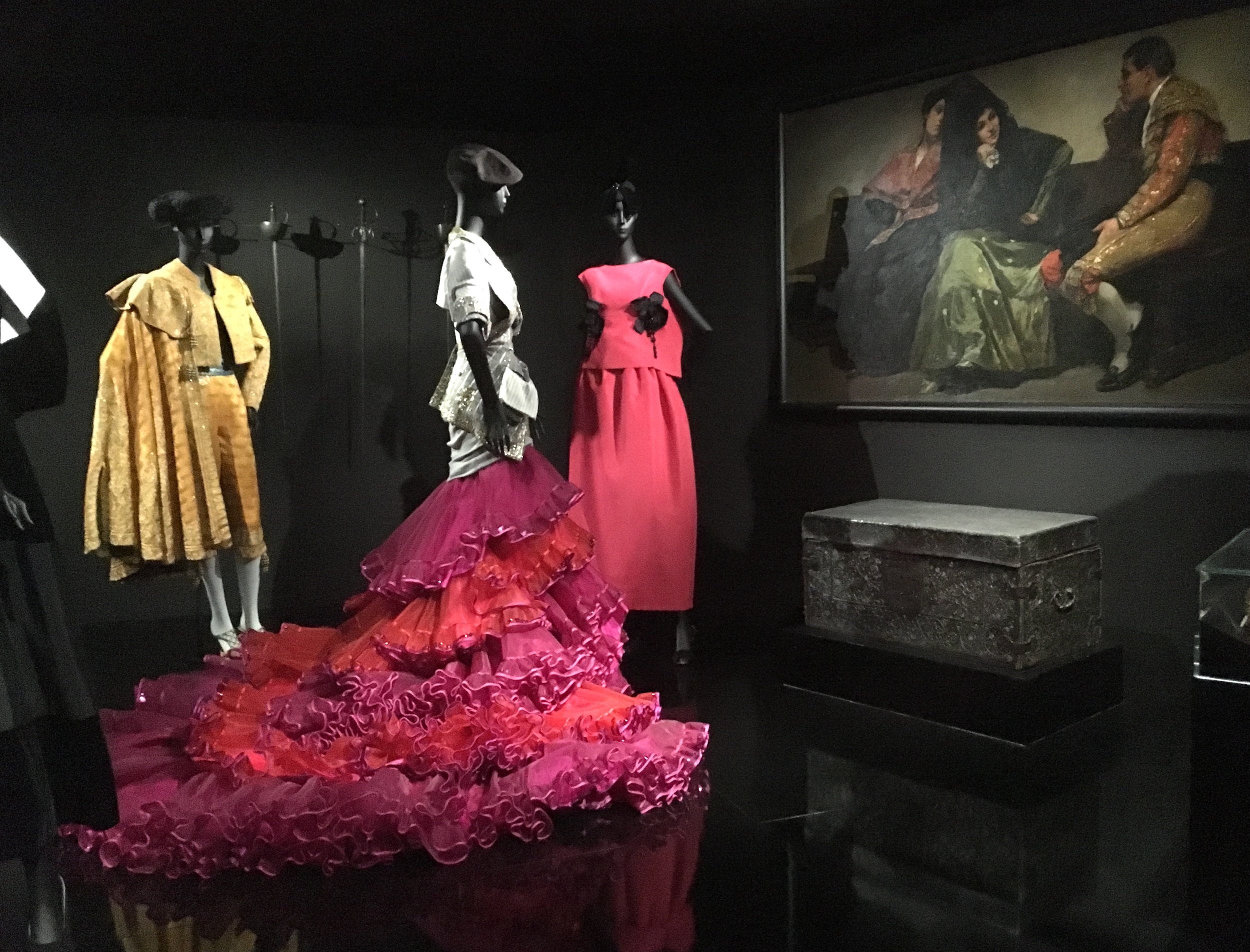
And garden inspired designs displayed under a tree.


Passing over to the other side of the entry, it seemed hard to believe there could be more to see.
An extremely high mirror ceilinged room with five tiers of white designs, a literally towering effect!

At the bottom a refreshing little mediated alcove about the craft of the seamtress.

Dior's fashion sketches

Entering the most modern phase of Dior's work
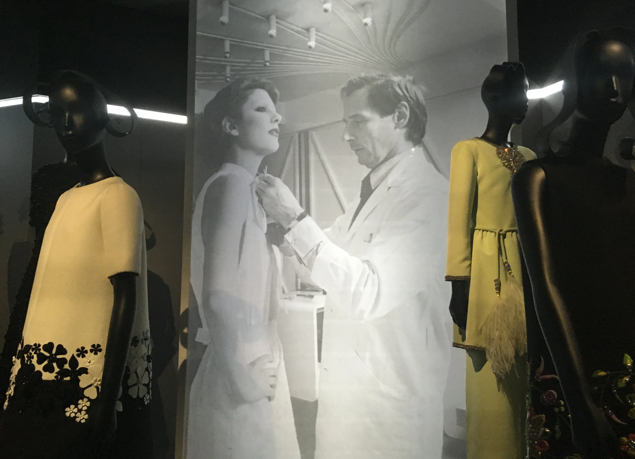
Only a few designs appeared in photos only.

At this point, the prolific arc of his career starts to really sink in. In this room, lighting shifted along the box edges, like searchlights crossing the sky.

Just as I was expecting to see the exit, we entered the grand finale; a ballroom fantasy in the huge atrium space, mirrored at either end.

Here the entire "ballroom" was covered in multi projections, walls and ceiling, cycling through day and night and from architectural details to Dior's sketches. Videos showed film clips of his designs worn by leading actresses.


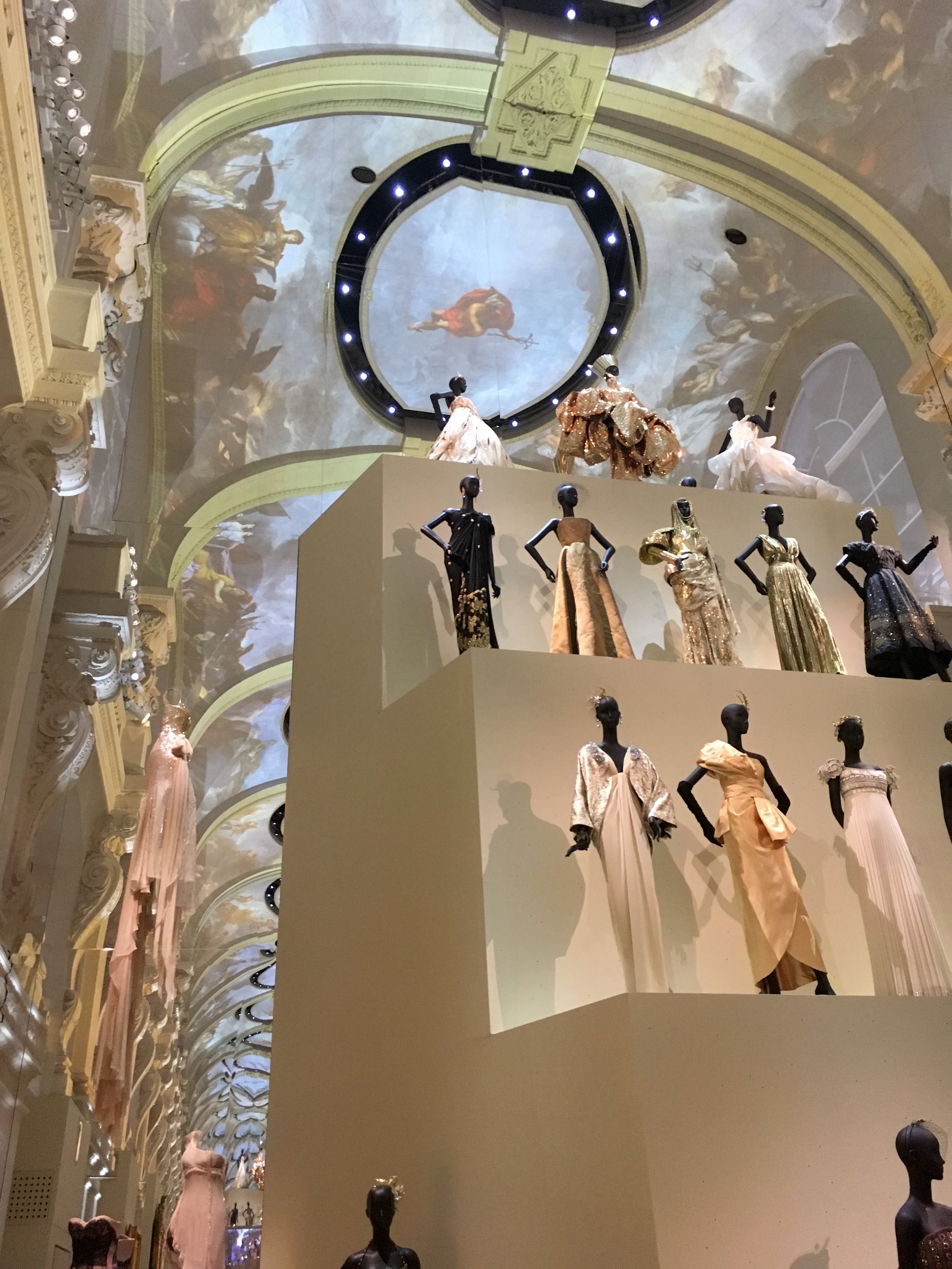
This was the final spectacle that just seemed to stun everyone.
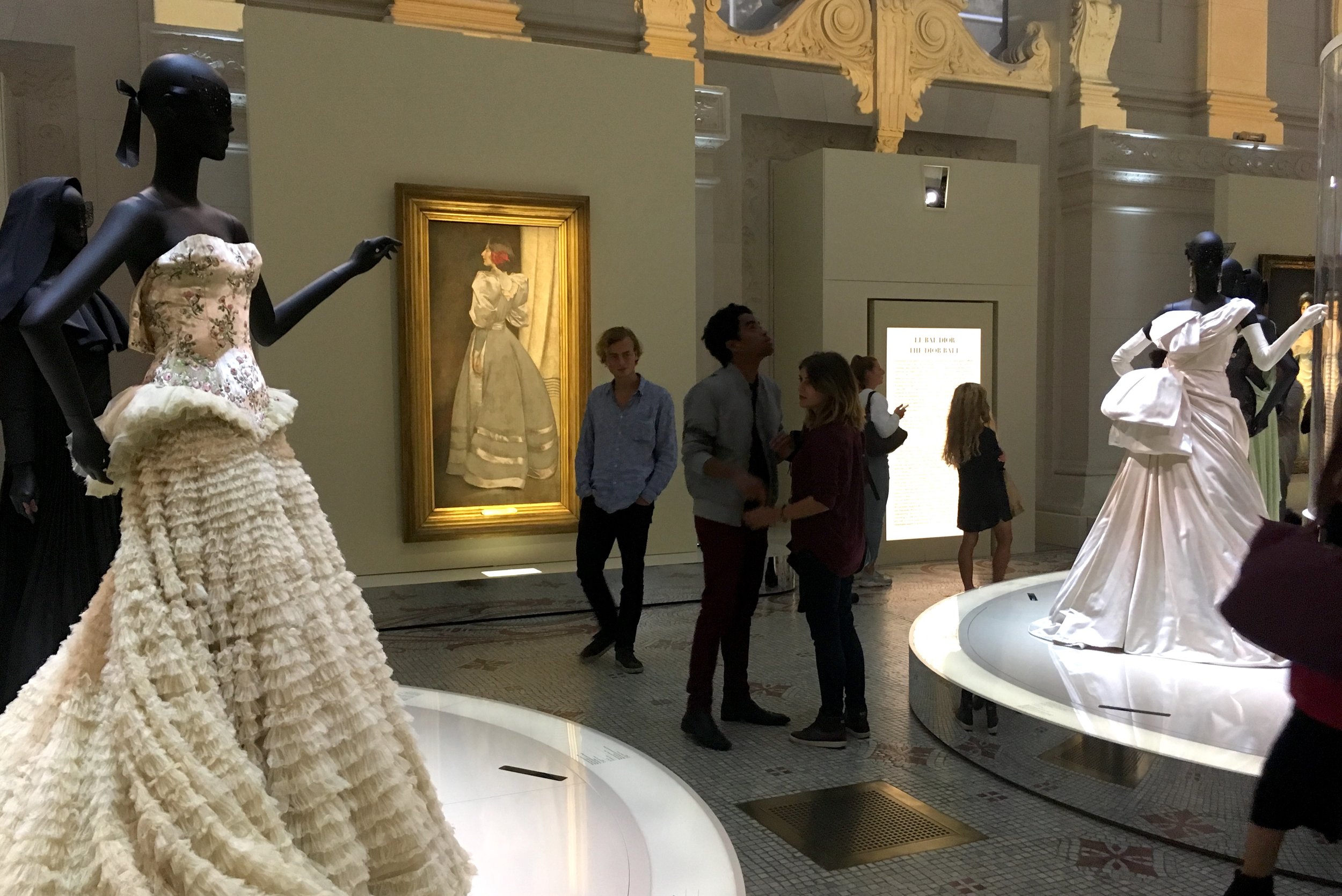
As I was leaving I was trying to imagine how much money was spent on this exhibition. Haute couture is an elitist art. I think the visitors, who seemed pleased and tired, got their money's worth. A lavish celebration of beauty, in the form of style.
Paris, France. Maybe it's been this way for a long time, but I only just noticed that Parisian columns are motorized, slowly rolling to change posters. Low tech is perfect for these old fashioned, quaint monuments. I think of them as uniquely french, but apparently they were designed by the Germans, in 1885, to avoid ads and messages pasted all over Berlin.

Vertical rolling posters as a street sign

Horizontal rolling posters on the side of kiosks. These endearing kiosks are being replaced by a new design by Matali Crasset, made of recycled glass & aluminum. Because the new ones look like sardine cans, Parisians are rightfully upset about the change. A case of function over culture.

Makes me wonder if these curved tile metro frames will disappear as well

Paris, France. This environmental campaign "calls out" specific individuals who have thrown trash outside the trash cans. "You can leave a more beautiful trace on the earth" is the warning. It's clever because it puts the focus on each of us as individuals, and our specific actions in real time.

But it's shame based. I wonder if it would be more effective to honor individuals when they put it in the can? With the message that you did something to beautify the world?

If it were honoring, not shaming, would it be more believable that these could be real people, not fictitious people?

Paris, France. What does it mean to be a connoisseur of olfaction? A good life skill for anyone in pursuit of refined sensibilities. It's no surprise that there several perfume museums in Paris. Certainly it's an arty twist on interactives about perception. "Making the invisible palpable, presenting this intangible heritage of perfume in the rooms of a museum, is the challenge accepted by Le Grand Musee du Parfum".

The title typography is treated with graduated metallic fingerprints. It spreads and rotates when it's animated. As a background, It makes the body text illegible.

The letter spacing of the body text is continually increasing from left to right, like fragrant molecules drifting into the air, and when animated it sometimes reverses, as if it's being gathered, or inhaled.


Some lines of the body text are wafting out like odorants, but some are not. The tenth line, for example, is tightly justified and really stands out here. The reading experience is a slippery road.

The first gallery, about the role of perfume in famous love affairs, is really fun. Cleopatra is winking here, but from another angle, she is not.

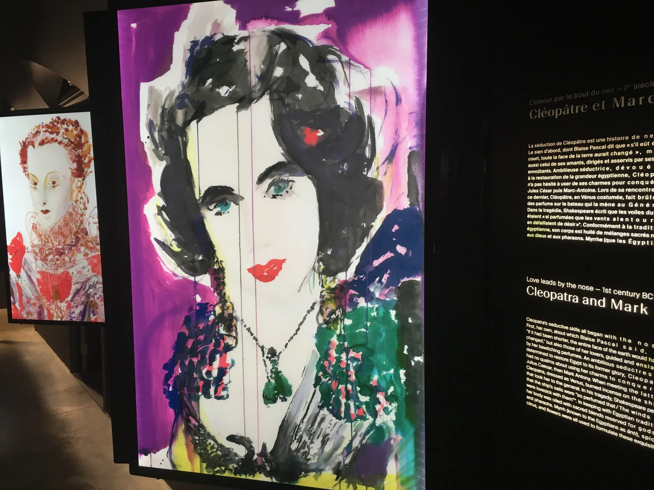
All of the angled side paintings are lenticular and change depending on angle.


Smell is a challenge, for sure. Or is it the smell dispensers that are tricky? There are many different types of dispensers here. Visitors come to the first smells, in the form of bowls in the ancient history section. The first impulse is to put your face in the bowl (unless you're too short), but that didn't seem to produce any scent.

There is no apparent on button. The hand icon suggests getting the smell from the bowl with your hand in some way. But this didn't seem to help.

The history is fascinating, with wonderful artifacts and stories about the use for scent, during the plague for instance.

Here the speaker-like scent dispensers were easier to use, but I found the scents to be just too subtle to really detect.


Silhouette, puppet-like animations

Perfume and fashion exhibitions are a common assignment for Parisian students.
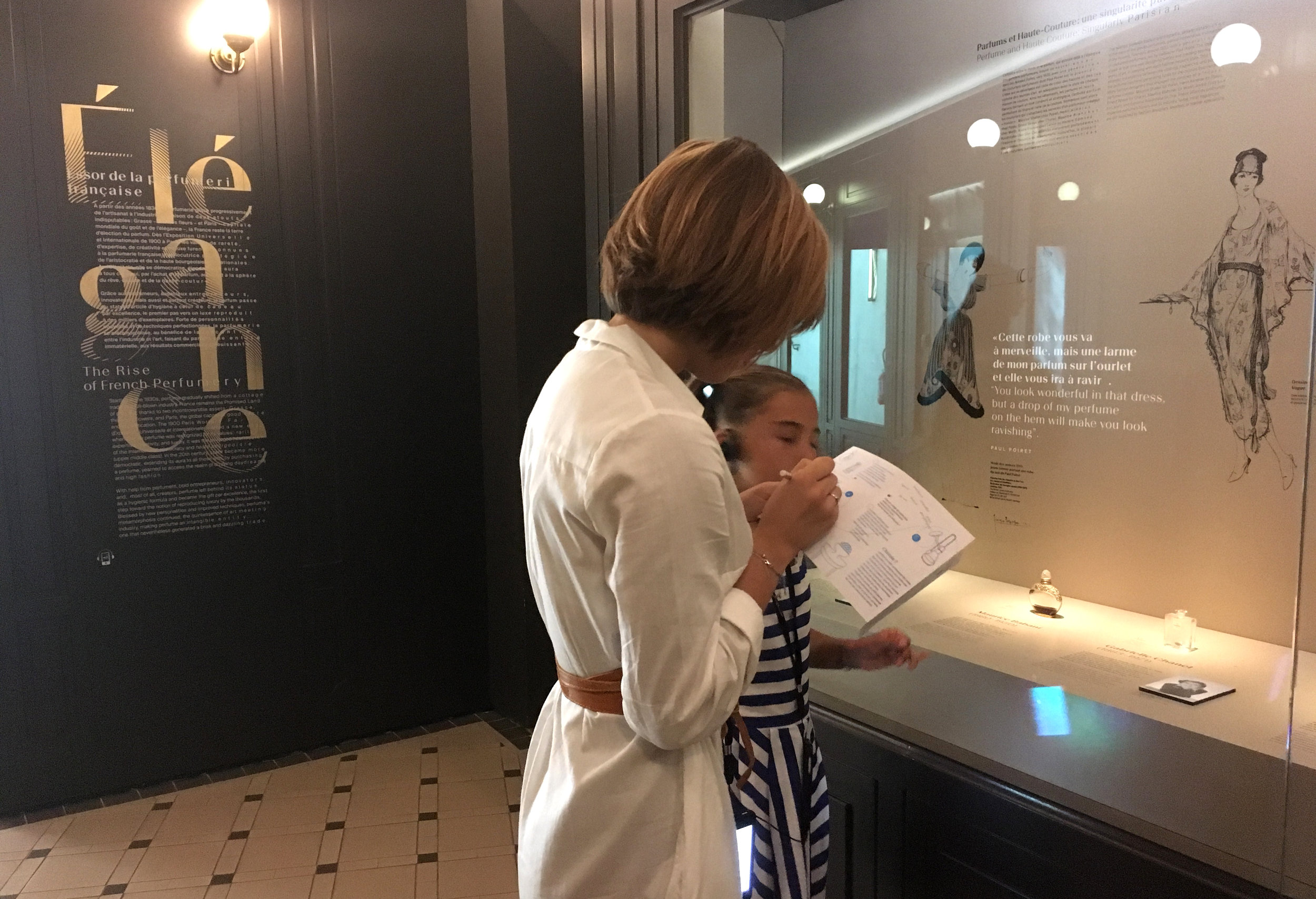
Fragrant Art History.

The laboratory was not in use when I was there, except by staff.

Upstairs visitors enter a more serious laboratory of basic scents used in the art of perfume, emphasizing "imagination, invention, and reflection in the intellectual process of creating a fragrance".

Here the scent dispensers are orbs, which worked well for getting a good strong sniff.
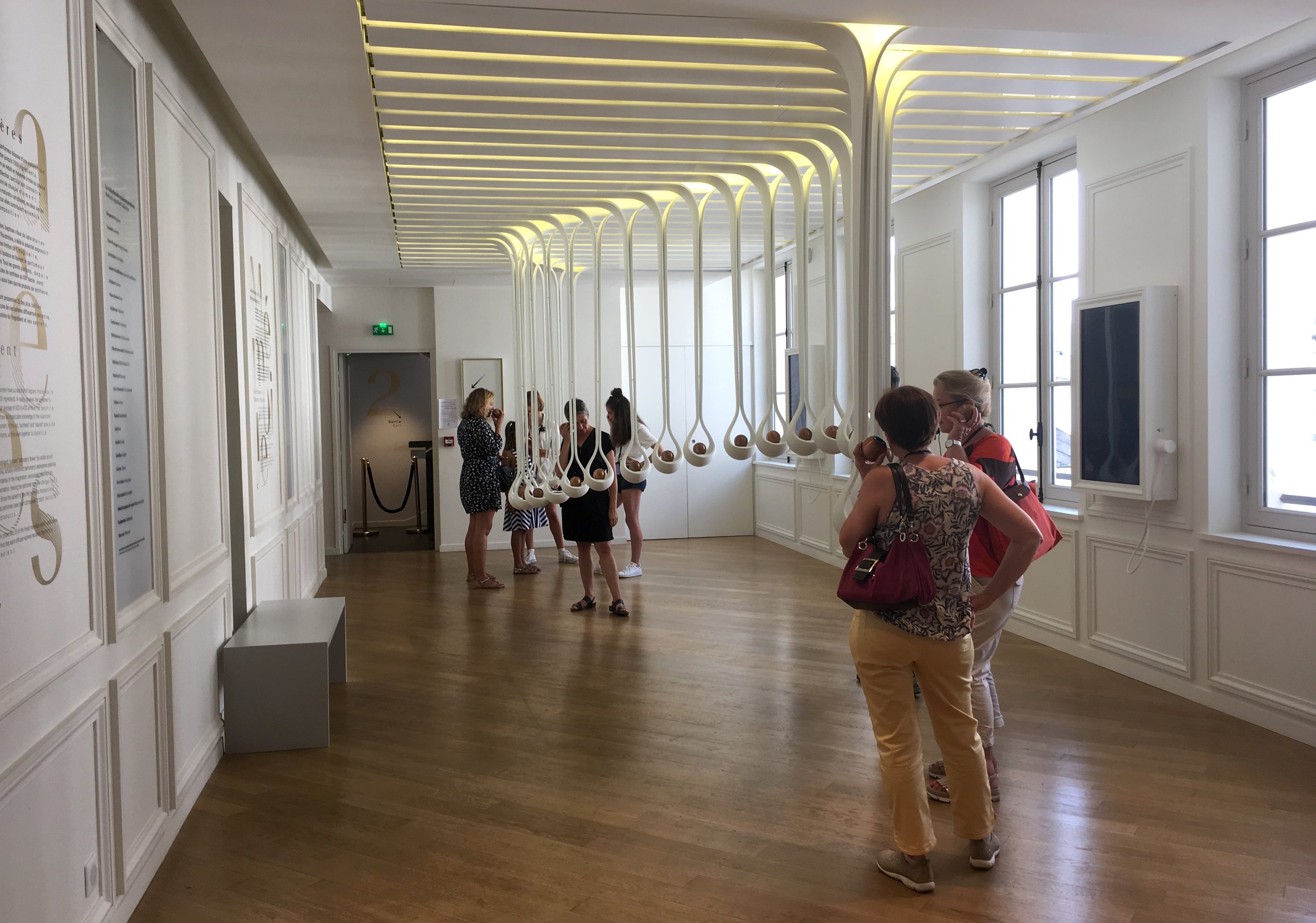
The orbs work for audio as well as smell. One of about 5 languages can be chosen by rotating the orb in it's holder, before removing it.
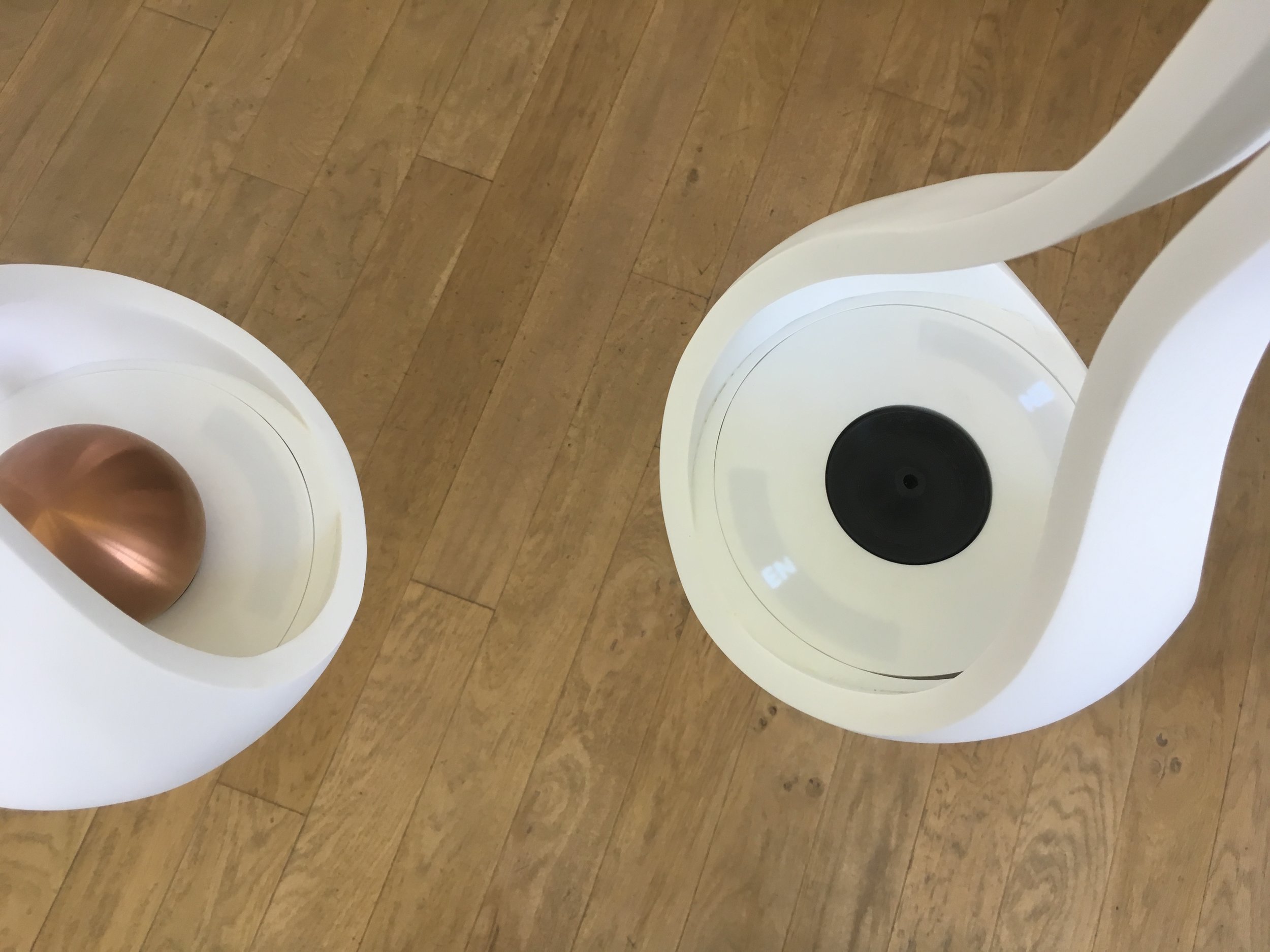
This was clearly the core experience of the museum, where diligent visitors were spending serious lengths of time. Quietly sniffing and listening. Even going back to repeat some of the scents.


A tribute to famous contemporary "Noses" takes the form of dressing tables

This looks pretty elegant for the "laboratory" area, where the olefactory perception process is explained. The theme of chemical compound shapes is reflected in the light fixture.

A voting station on perception of scents based on gender. There seemed to be more women visitors here than men.

Another, flower-like scent dispenser was pretty effective.

It occurs to me that this display would be comical, seen out of context.

Then there's a smell garden, with 11 smells to guess

Here the smell dispensers were funnel-shaped flower heads, which didn't seem to work. Some were lit up, and some had subtle images inside to indicate the answers.

After the gallery of orbs, I think some visitors expected audio as well.

A view of the real garden beyond the artificial one.

This love seat uses the speaker-like dispenser again.
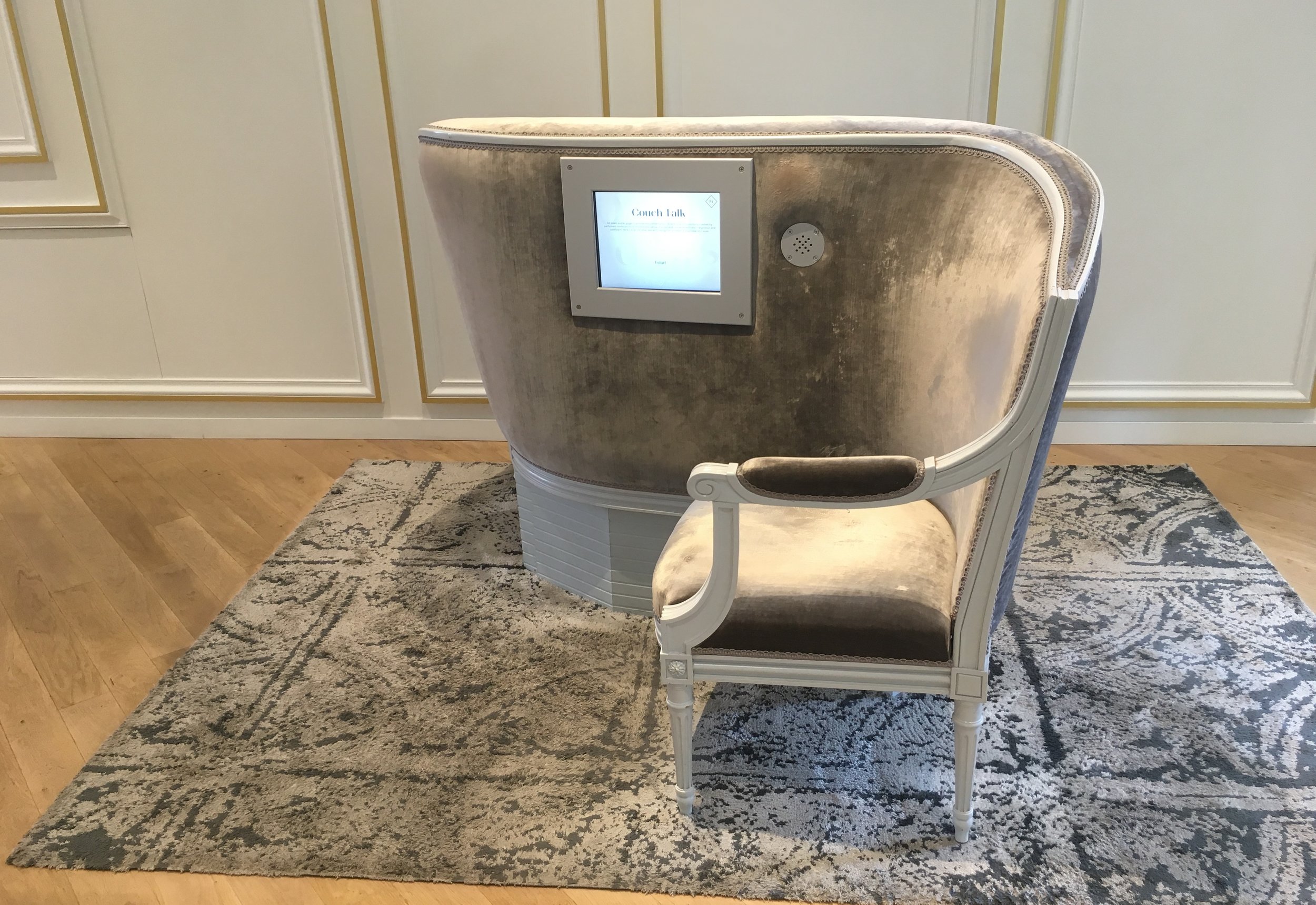
Wall alcoves that dispense smell had stringed curtains, and colored light to give a visual clue to where the scent is.

Finally we come to another test your senses area, this one with paper strip dispensers, like the ones used in perfume stores, which worked great.

A simple comparison of 3 scents, with identifying pictures to line up


It seems like the tally sheets are often on a window sill.

The museum store carries over the design of the galleries, including the drifting typography.

Here there are even more types of dispensers; ribbon, cups...

And free form glass blown shapes at the scented glove display

This is the final perfume dispenser for purchased bottles

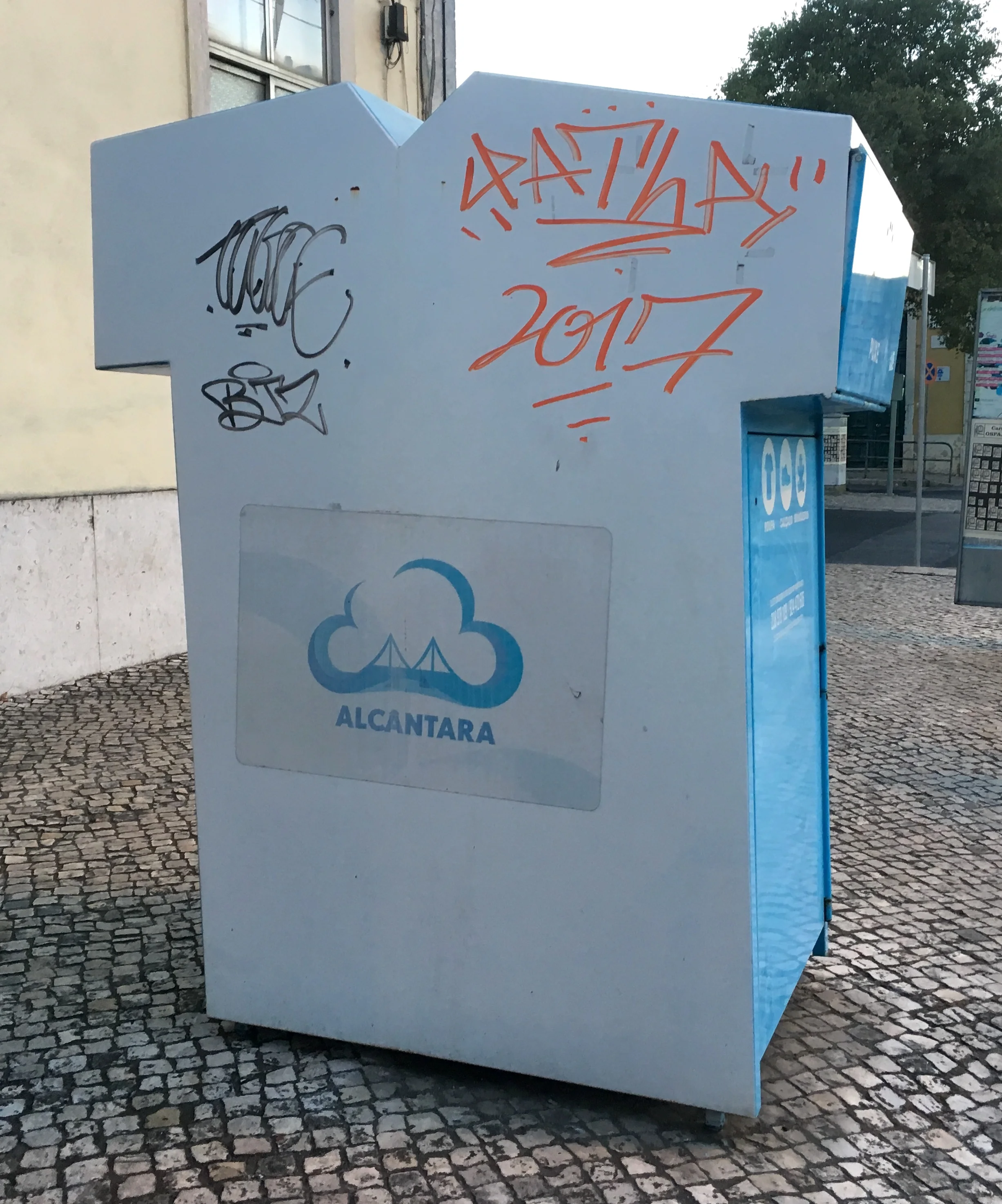
Lisboa, Portugal. A donation box, with finger holes, is shirt shaped from the side.

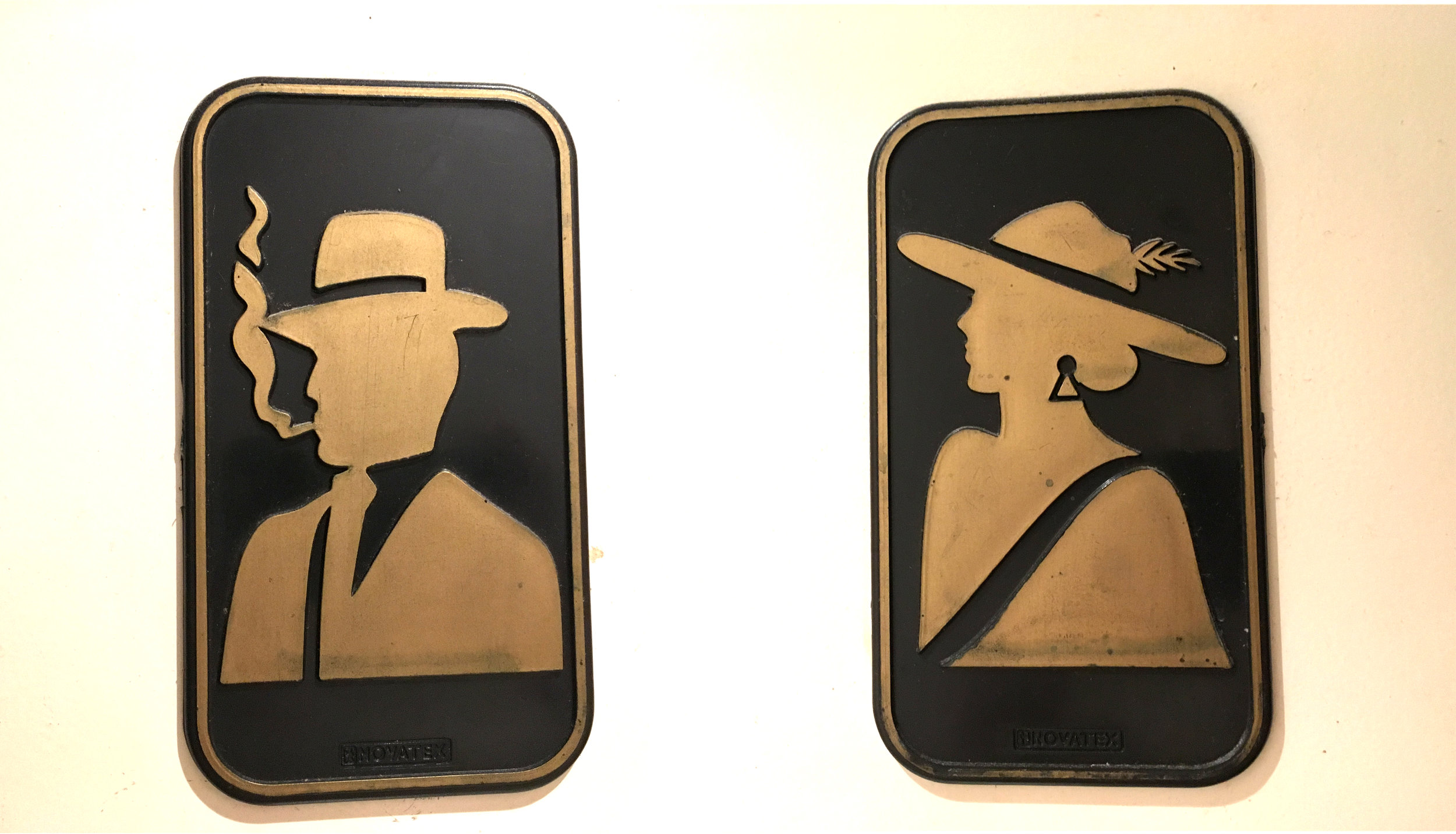
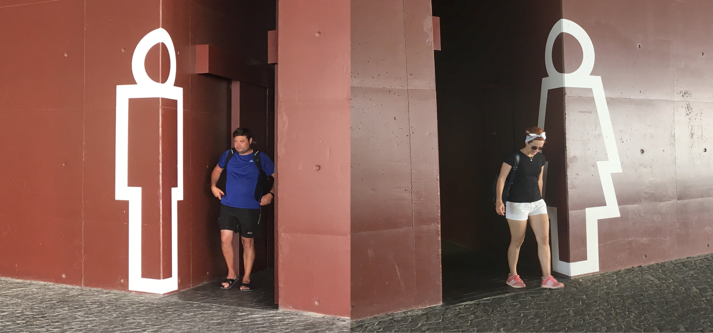
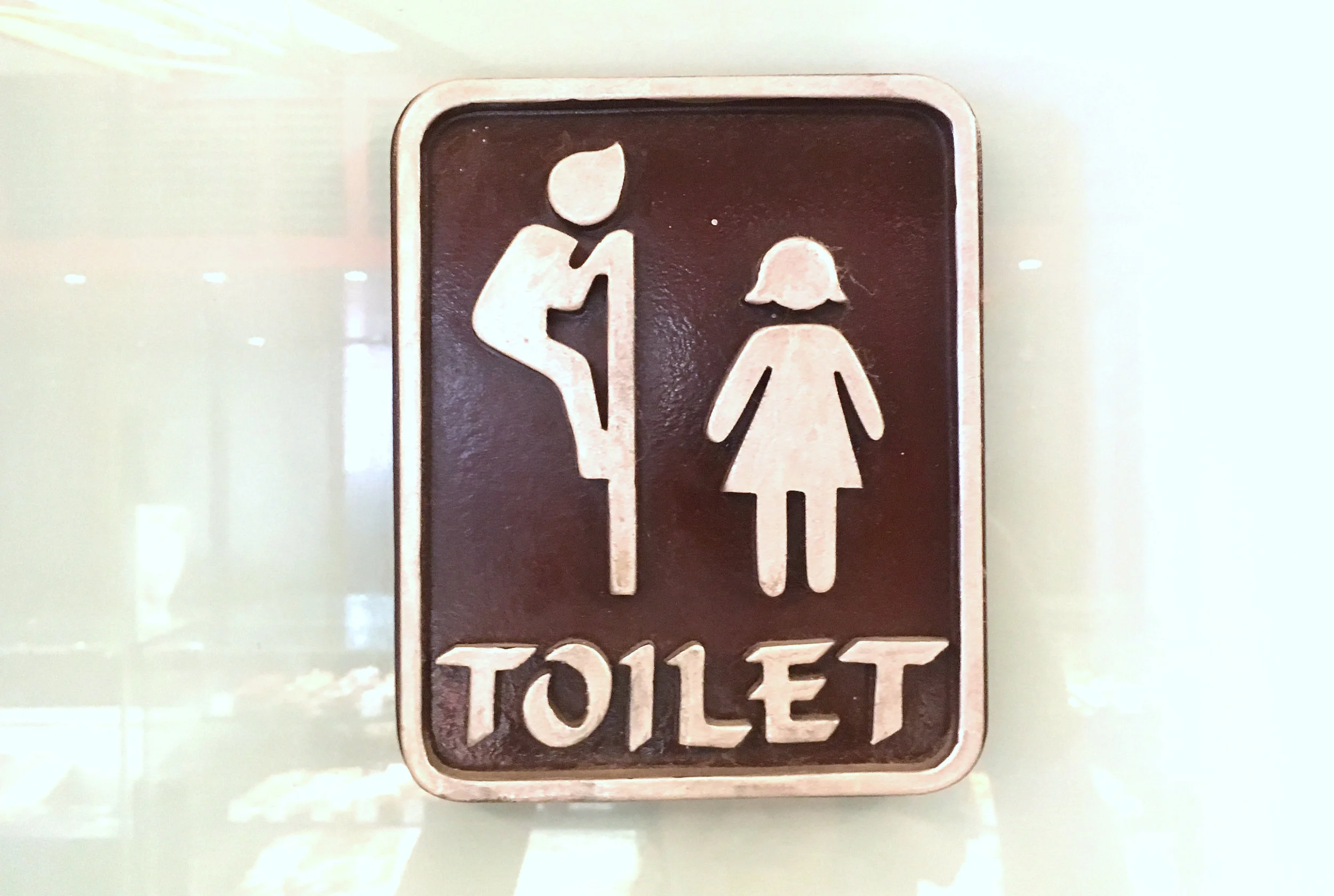
Some examples of the men & women I have encountered on this trip.


