Casa da Musica (Porto)
Porto, Portugal. This building (and skateboard park), designed by Rem Kohlhaas, is difficult to capture in one photo. Walking around it is a constantly close view, with neck straining views upward at the angled planes.
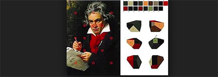
I came to pay my respects to the logo designed by Sagmeister & Walsh for the Casa da Musica. Based on the building's shape, which looks different from every angle, the logo can rotate freely, like the "roll of the dice."
It was designed so that subidentities can pick up on various angles, image colors, typography or textures, in almost endless ways.
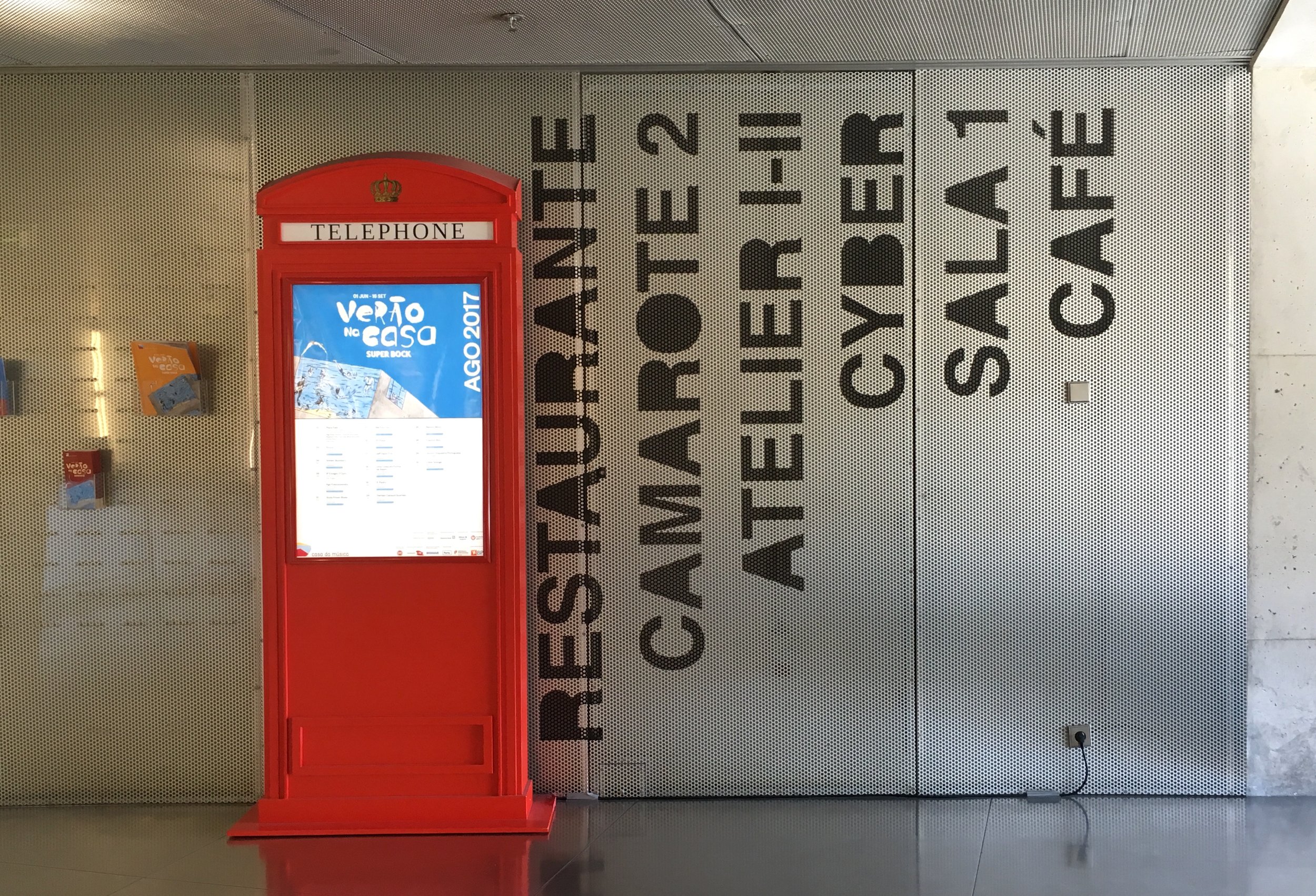
I admire the sophistication and versatility of the logo and I was hoping to see it in action, on the building and on different printed materials. In all it's glory. But first I noticed, along with the lower case logo font, what seemed like an odd mix of other font treatments.
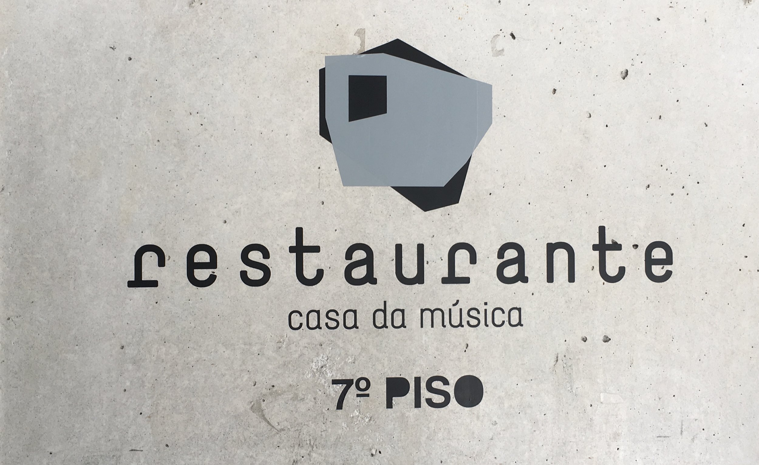
The mirrored logo at the entry was promising.
But then I started to worry that the logo concept, with its shaping and rotational motion, had been tampered with. It seemed incorrect, flattened, and frozen, especially when used as a pattern.
Branding is about creating beautiful order. A versatile logo like this can only work if it is applied in the way it was intended, conceptually. I'm sure there's a good story here, about why it went astray. But I left feeling sad.


