Fenomen Fotollibre (Barcelona)
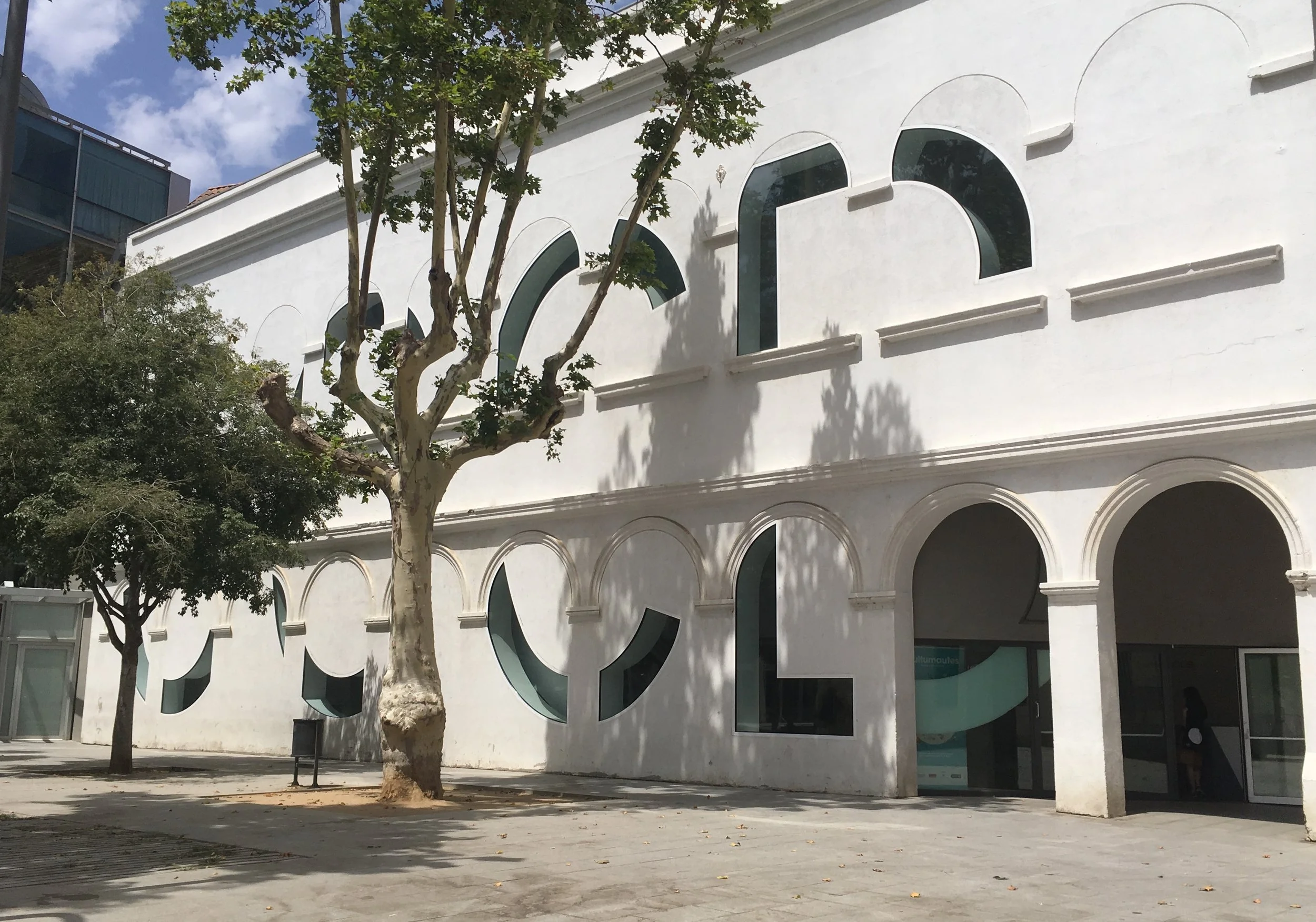
Barcelona, Spain. The CCCB cultural center is where I discovered a truly overwhelming exhibition on the photobook phenomena. First though, what I love about the building. The windows form the typography.
The inside courtyard is an example of daring old-meets-new architecture, with interesting reflections.

The ornate architectural alcoves make excellent framing for exhibition posters.

Teens were using the courtyard space to practice dance routines.


The exhibition entry title area was uninspired.

Maybe that's because the exhibition is very complicated and thorough, with 500 books, 9 curators, 7 contemporary artists, and 7 tantalizing themes. The main photobook history is curated by Martin Parr, and leads the visitor from the entry, through and around all the other themes.

One of the stated goals of the exhibition is to address the challenge of displaying books. Methods used included wall mounted actual pages or original photos, and valuable books displayed open under glass. Touch screens with interactive page spreads appear in various sizes.

Sequences of page spreads are projected into cases (from the floor up).

and some of the wall mounted sequences of page spreads show hands turning the pages.

And there are some actual touchable books to flip through by hand.

There is enough variety in all these methods to keep visitors visually engaged.

The exhibit exits through a comfortable lounge area with actual browsable books. Tables are multi-level and the books are board mounted to carry around.

An "air drop" treatment in the protest and propaganda area.

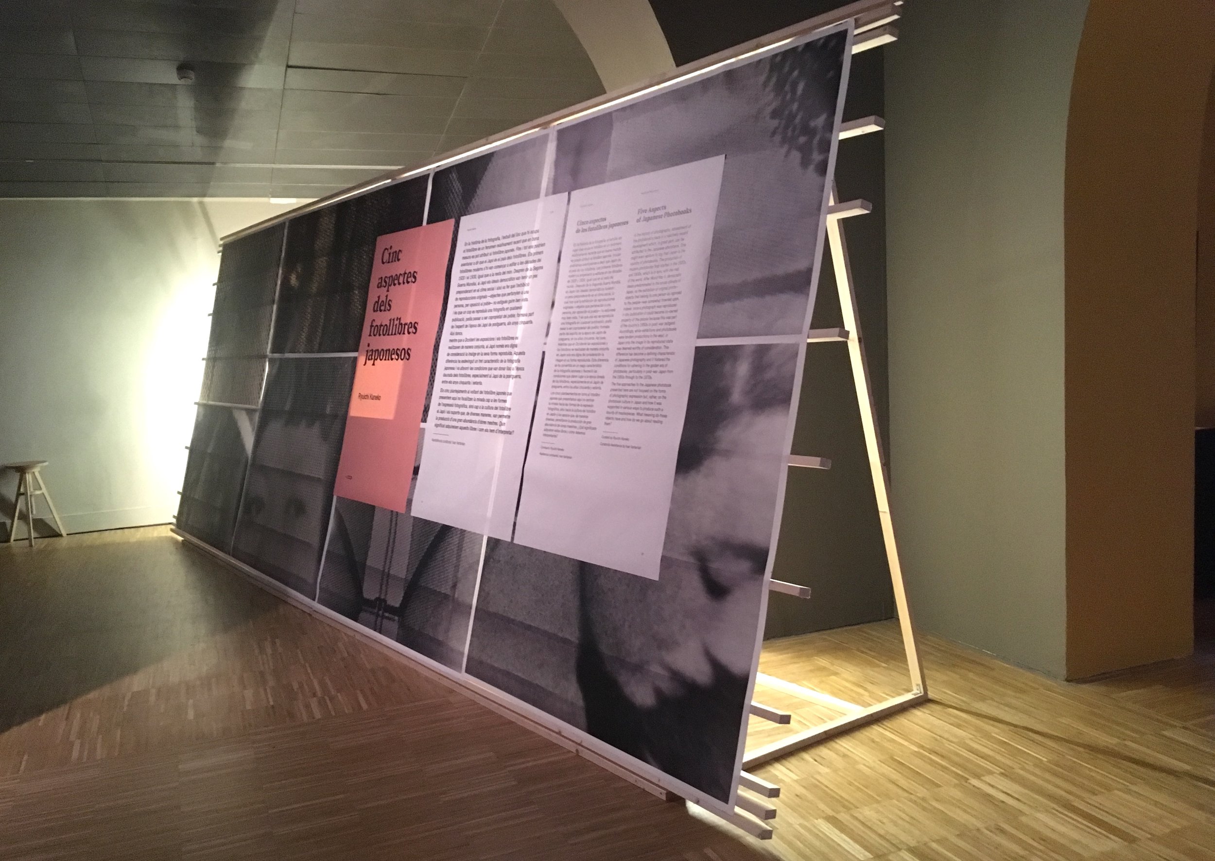
A delicate backlit title treatment for the Japanese photobooks


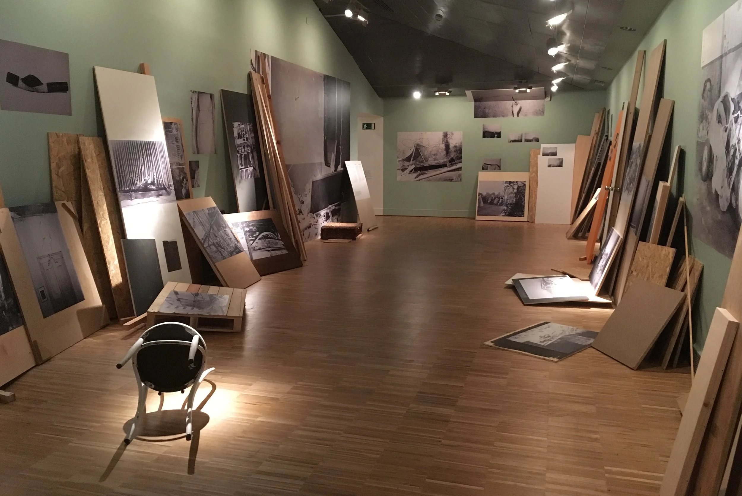
The "Fascinations and Failures" theme was explored in interesting ways. Considering the value of "mistakes" and rejects.
As a graphic designer who loves to collaborate with photographers, the most exciting section was "Reading New York", a "PhotoBookStudy" on William Klein's famous 1956 photobook "Life is Good and Good for You in New York." (PhotoBookStudies are investigations made through The PhotoBookMuseum in Cologne, Germany.) Described as a "rhizomatic mapping," it is a "contemplation on the reading process, merging the chronological reading experience with simultaneous visual and associative stimulation".


This is an analysis done by "readers" many years after this breakthrough photobook was published. To me it's the fundamental process of visual literacy. It's what happens between a graphic designer and photographer collaborating on the making of a book. It's the discussion we have working with photos and text, making associations and choices about content, discovering order. Playing with contrast, grouping, themes, patterns and pacing. I consider it the real work of graphic design, enhanced by layout and typography. I was thrilled me to see this graphic design thinking process visualized in an exhibition, for the public.

The exhibition was linear, running around the room. Here are a few details of the notation.


