BART (CA)
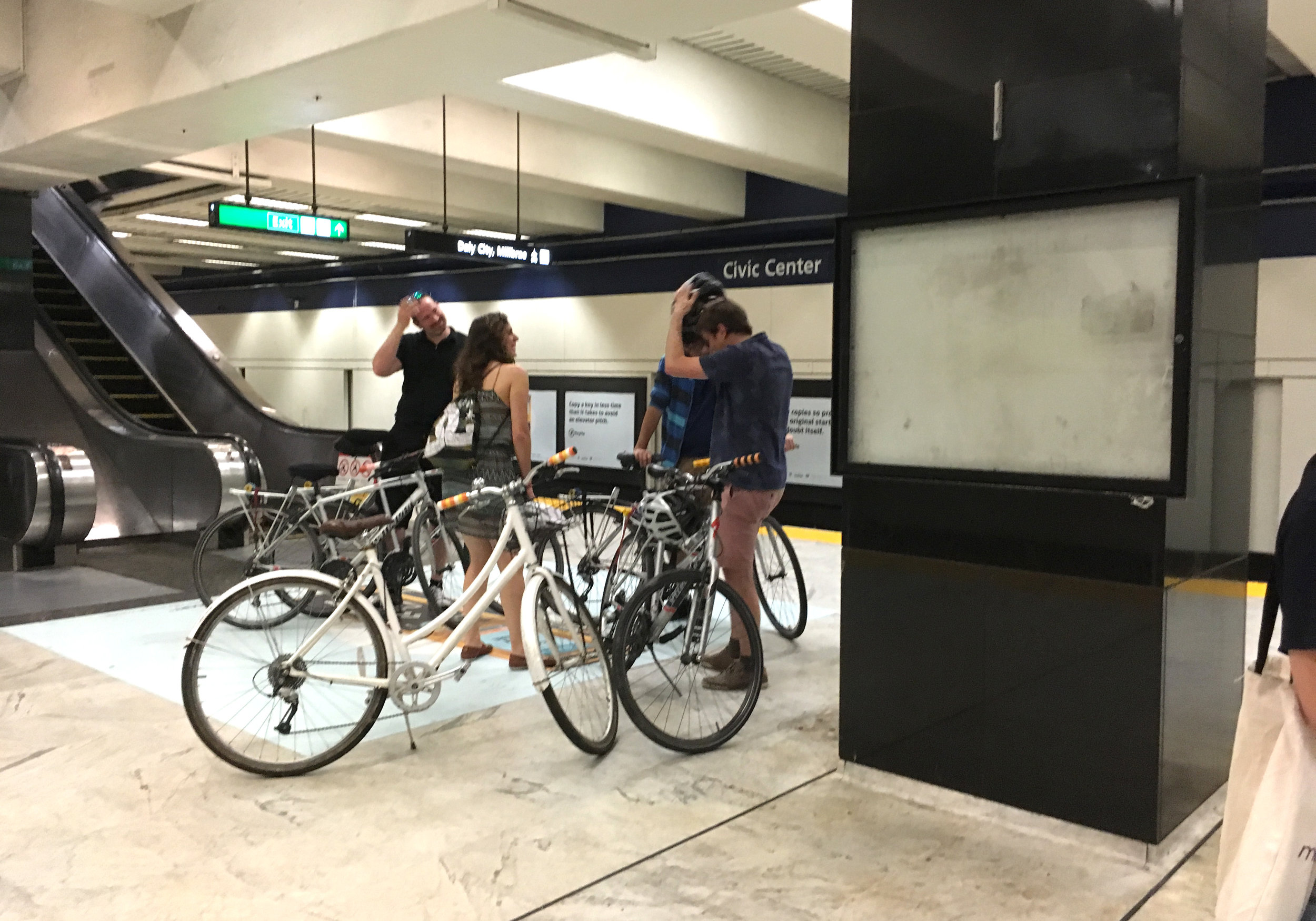
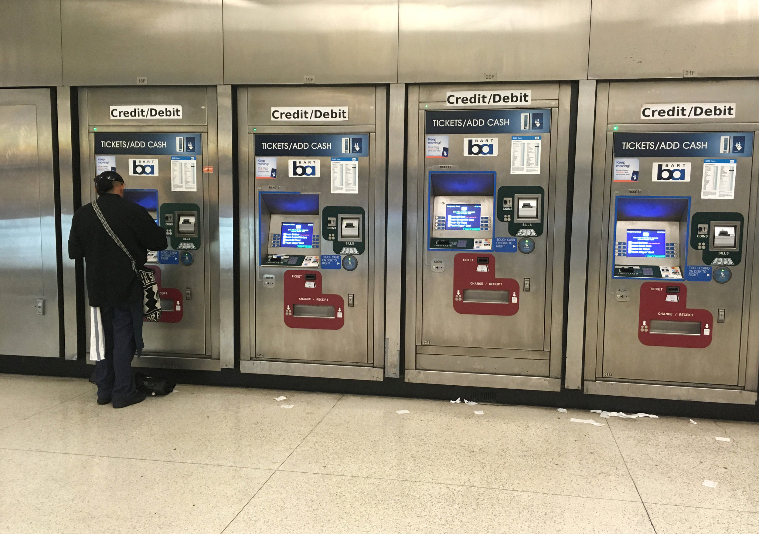
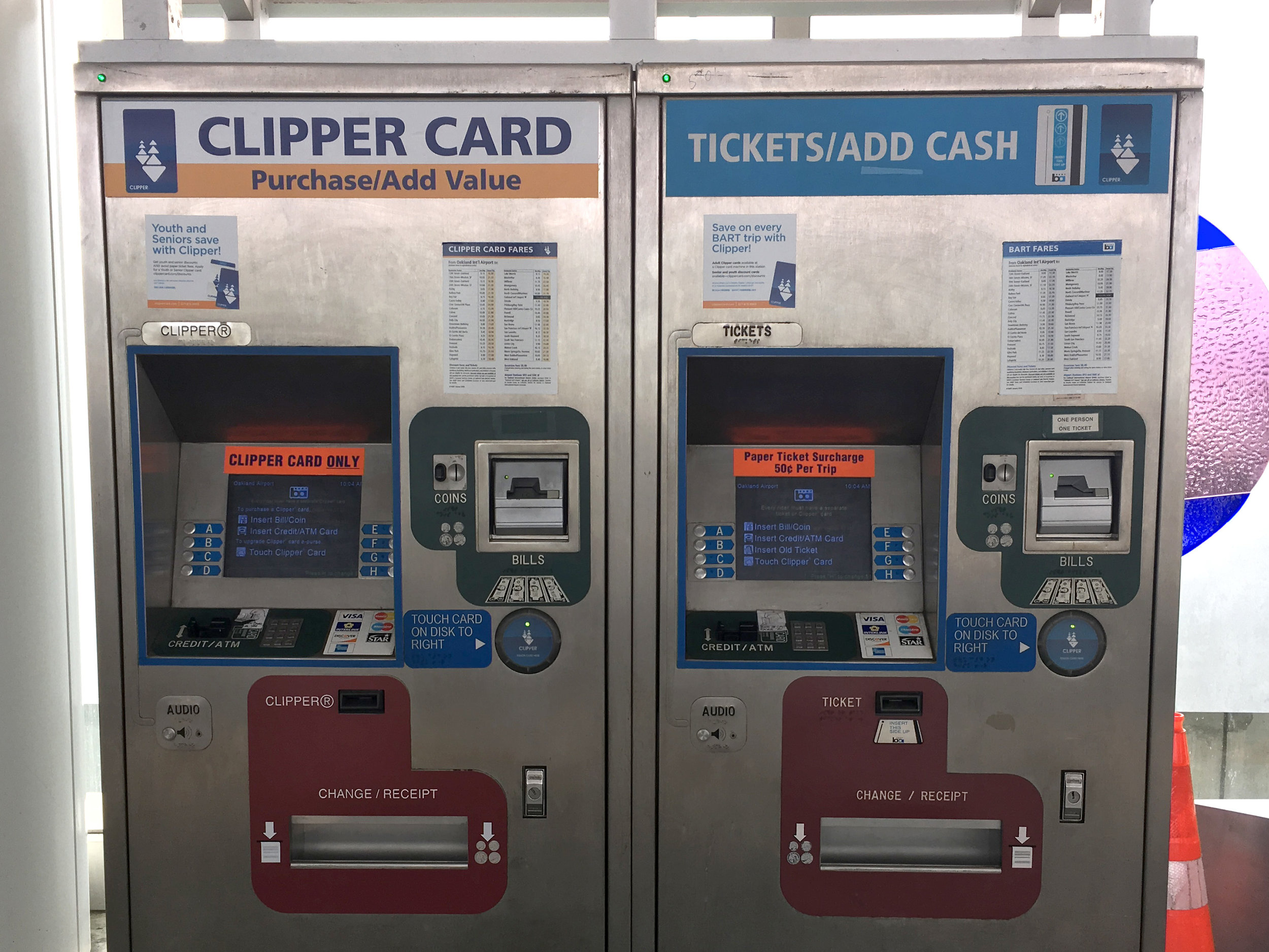
San Francisco. Don't get me started, because I don't know where to begin. I weep (and scream) inside every time I see visitors trying to use SF's BART ticket machines. As a local graphic designer I feel a deep and bitter shame.

This is how visitors are welcomed to our world famous city.

Terrible wayfinding design is an extra level of aggravation, on top of other challenges with our (various) public transportation systems. Nothing about this is elegant, simple, consistent or intuitive. Worst of all, the constant additive tweaking is repetitive and ugly. The extremely amateurish fixes just add confusion to confusion.
Here are some of the gruesome details!


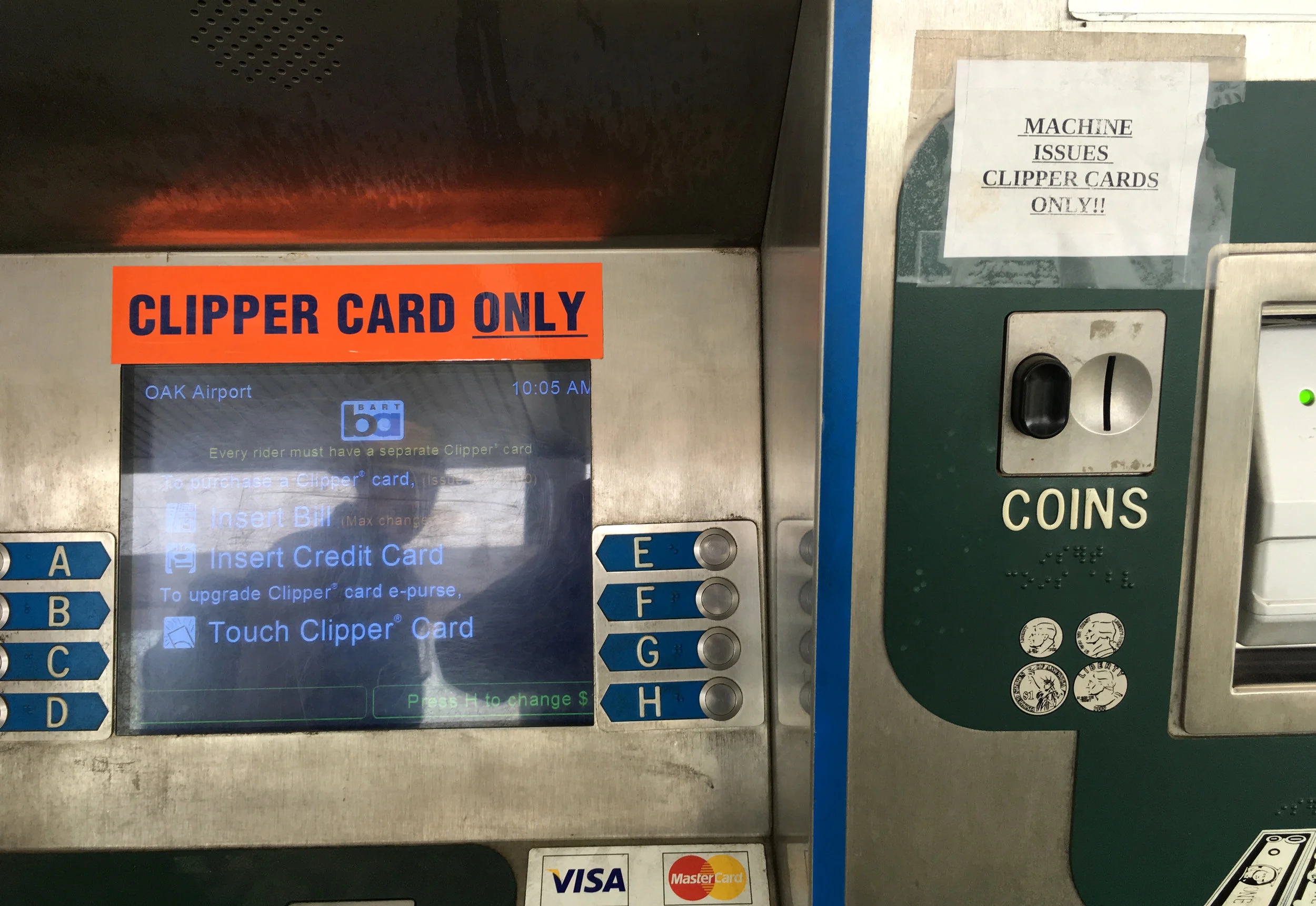
Here's an overview of the user's experience. So sad. I hate this situation with all my heart.
About a month later, maps disappeared from the platforms all together.